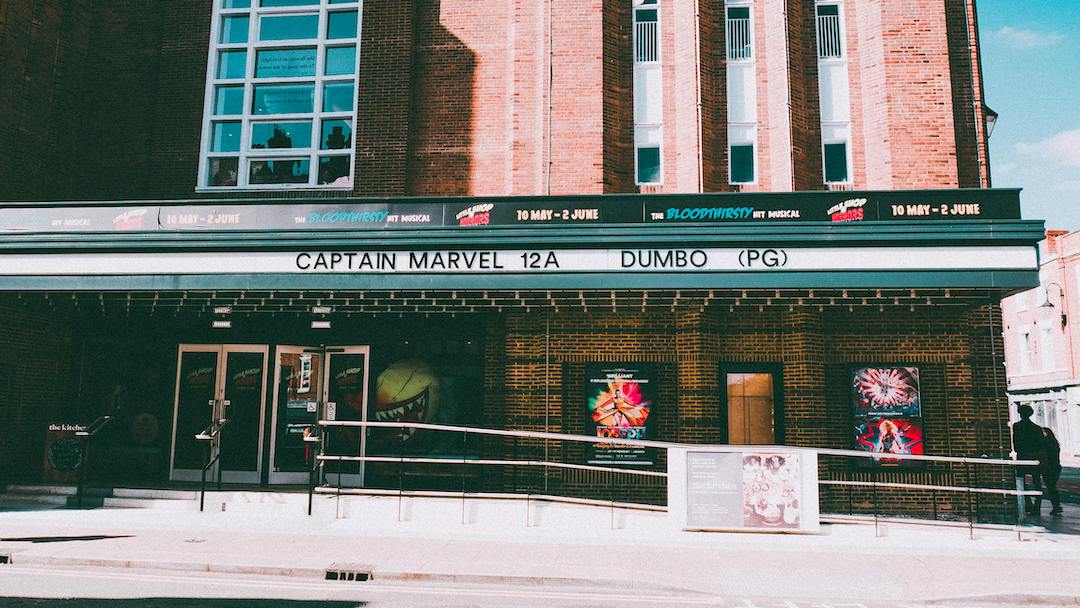
“Key art” is the visual backbone of your film’s marketing. At its simplest, it’s your poster—but in reality, it’s much more than that. It extends across everything from streaming thumbnails to social media assets, forming a cohesive visual identity for your film.
Done well, key art instantly communicates three things:
what the film is, who it’s for, and why someone should care.
It also needs to be flexible. Today’s campaigns demand artwork that works just as well in portrait, landscape, and square formats—whether it’s on a cinema wall, a phone screen, or a streaming platform.
A Quick Evolution of Film Posters
Film posters haven’t always looked the way they do now.
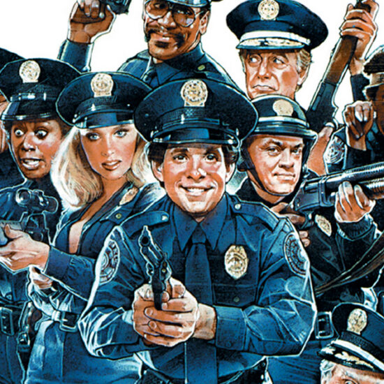
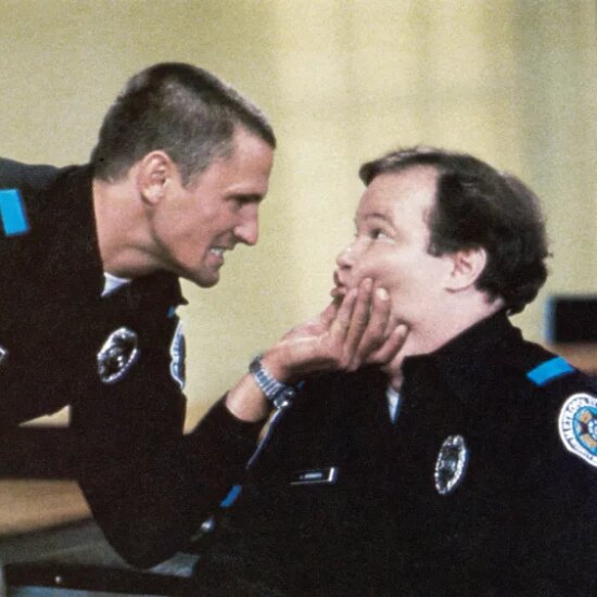
Back in the 70s and 80s, posters were often beautifully hand-illustrated—rich, detailed, and instantly iconic. By the 90s, digital tools shifted the industry toward photography. This gave rise to cleaner, simpler designs… and also some overused ideas (like the infamous “floating heads”).
Today, the trend leans toward minimal, bold, and striking imagery. But the reality is: there’s still a huge range—from brilliant to forgettable.
Why So Many Posters Look the Same
If you’ve ever felt like film posters blur into one another, you’re not wrong.
Like any area of marketing, key art is full of trends and tropes. Once something works, it gets repeated—often to the point of exhaustion.
Some common patterns include:
- Colour coding by genre
Blue and orange for action/sci-fi. Yellow for indie comedy. Dark blue tones for thrillers. - The “floating heads” composition
A collage of cast faces layered over a background—still widely used, especially in big studio films. - Back-to-back characters
A go-to for rom-coms and buddy movies. - The lone figure (seen from behind)
A staple for westerns and action dramas. - Close-ups of eyes or faces
Particularly common in horror and psychological films.
These visual shortcuts exist for a reason: they help audiences quickly recognise genre and tone. When someone is scrolling through endless content, familiarity can be a powerful trigger.
But there’s a fine line. Lean too heavily on clichés, and your film risks looking generic.
The Balancing Act: Familiar vs Original
Great key art sits somewhere between recognisable and distinctive.
Audiences want signals they understand—it helps them decide quickly if something is “for them.” But they also want something that stands out.
That’s why simplicity often wins. A clear, bold idea that reads instantly at thumbnail size can outperform a more detailed, “clever” design.
What Makes an Effective Poster?
There’s no exact formula, but strong key art usually does a few things well:
- Clearly signals the genre
- Highlights key cast (if relevant)
- Uses strong, high-quality imagery
- Keeps the concept simple and readable
- Works at small sizes (think streaming platforms)
Sometimes posters include critic quotes and star ratings—but not always. Many modern campaigns favour a cleaner, more minimal approach, especially for teaser artwork.
Why Assets Matter (More Than You Think)
One of the biggest challenges in poster design isn’t creativity—it’s what you’re given to work with.
If your production stills are weak, your poster will struggle. It really is that simple.
You can try to fix gaps with stock imagery, compositing, or even new photoshoots—but all of this adds cost and complexity. And sometimes, the simplest solution (using what already works) is the best one.
The takeaway?
Invest in strong photography during production. It pays off later.
Don’t Get Lost in the Details
It’s easy to obsess over tiny design tweaks—moving a logo slightly, adjusting spacing, refining small elements.
But audiences don’t see posters that way.
They react instinctively:
“That looks good, I’ll watch it” or “That doesn’t interest me.”
Detail matters—but over-polishing doesn’t move the needle. Your time is often better spent getting the artwork in front of more people.
Using (and Adapting) Supplied Posters
If you’re a distributor, you’ll usually receive a poster as part of your acquisition.
Sometimes it’s worth using it as-is—especially if it’s strong and aligns with your audience. Other times, you’ll adapt it:
- Resizing for different formats
- Adding local ratings and certifications
- Updating taglines or quotes
- Adjusting billing and logos
This process is called localisation—and it’s standard practice.
When Things Go Wrong (And How to Fix Them)
Missing full-body shots? Weak imagery? No clear focal point?
These are common problems.
Workarounds include:
- Creative compositing using existing stills
- Supplementing with stock imagery
- Shooting small additional elements (hands, backgrounds, textures)
- Planning carefully to maximise what you do have
Constraints can actually lead to more inventive solutions—but they also highlight the importance of planning ahead.
Why Design Is Worth Paying For
For independent filmmakers especially, budget is always tight. But cutting corners on key art is a false economy.
Your poster is often the first—and sometimes only—chance to grab attention.
A professional design doesn’t have to be expensive, but it does need to look credible. Poor artwork can undermine even the best film.
Creative vs Commercial: A Necessary Tension
There’s often a disconnect between how filmmakers see their film and how distributors want to market it.
Filmmakers may favour subtle, nuanced artwork. Distributors may push for something clearer and more commercially recognisable.
And honestly, in a crowded digital landscape, the simpler option often works better.
A poster isn’t just an artistic expression—it’s a tool. Its job is to stop the scroll and drive interest.
A New Golden Age of Poster Design?
After a period where film posters felt increasingly formulaic, there’s been a noticeable shift.
Some distributors have embraced more distinctive, design-led approaches—bringing creativity back into the space.
At the same time, there’s also a renewed appreciation for older styles, particularly illustrated posters, now reimagined in modern ways.
Final Thought
Key art isn’t just decoration—it’s strategy.
It’s how your film introduces itself to the world.
And in an era of endless choice and shrinking attention spans, that introduction has to work instantly.
So whether you go bold, minimal, familiar, or completely original—make sure your key art does one thing above all:
Make people want to watch your film.
About the Author
I’ve spent years working across film distribution, marketing, and design—helping bring films to market and making sure they connect with the right audiences.
A big part of that work has involved developing key art campaigns: from creating posters from scratch to adapting international campaigns for UK release, often working with limited assets and tight budgets. I’ve worked on everything from independent films to larger international releases, collaborating with designers, agencies, and distributors to shape how films present themselves to the world.
I’m particularly interested in the intersection between creative design and commercial strategy—how a single image can influence perception, positioning, and ultimately, performance.
Need Help With Your Film’s Key Art?
If you’re a filmmaker, producer, or distributor looking to elevate your film’s visual identity, I offer:
- Key art concept development
- Poster design and art direction
- Campaign adaptation and localisation
- Strategic positioning and marketing insight
Whether you’re starting from scratch or working with existing materials, I can help you create artwork that not only looks great—but works.
Feel free to get in touch or connect if you’d like to discuss a project. You might find that it’s more affordable than you imagine!
Jonathan Sadler is an entertainment marketing lead, distributor and content strategist specialising in independent film, television and music culture. With senior experience spanning theatrical releases, home entertainment, audience growth and fan-led campaigns, he has worked with companies including Arrow Films, Revolver Entertainment, Momentum Pictures and Warner Music. Jonathan is also the author of Film Marketing & Distribution: An Independent Filmmaker’s Guide and currently works across film releases, content campaigns and creative audience development.
Related