Sets need to say different things in different scenes, and you have to know how to respond.
This post is written by Clarence Major III.
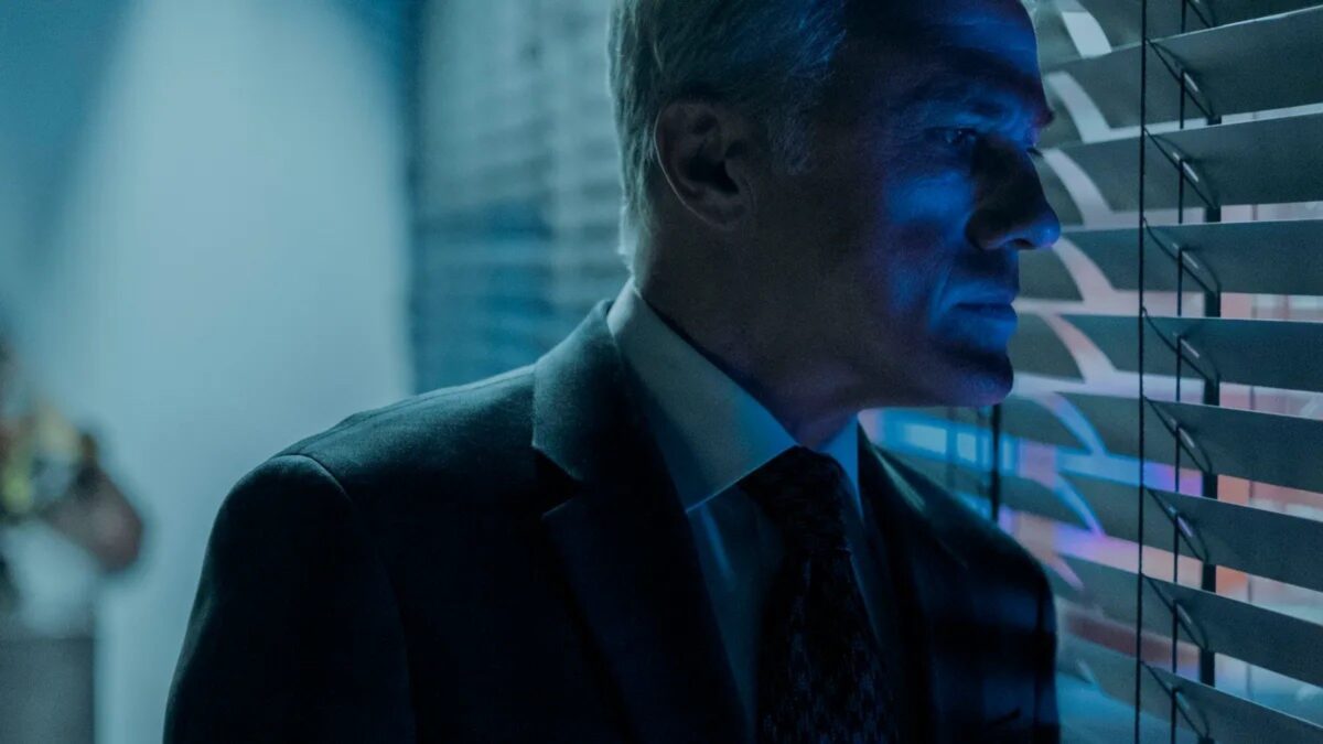
Regis Patoff (Christoph Waltz) is the perfect character to design around. Christoph Waltz brings a sinisterly brilliant, poignant, personality-piercing character at the center of the series The Consultant to life. He is a personality that can’t be identified with the history and is untraceable, but at the same time can’t be ignored in the present. He’s a freight train barreling toward us, and we can’t escape or look away.
His very presence evokes mystery, intrigue, and intense visceral fear. These ingredients allowed me to create a storytelling thread throughout my set design for the series. I often balanced on a precarious tightrope on whether to be covert or overt about the design intention in my choices. The scope was up for examination, everything from colors, texture, and light in the built scenery, set dressing, and props.
Designing for the Themes of The Consultant
I was captivated by a few prevailing themes demonstrated to the viewer throughout the show that drove my most significant decisions. First is a magnetic sense of “entrapment.” It was of paramount importance, and it is what we, as the audience, are being drawn into through the eyes of our characters.
The second is the graphic theme in architectural navigation is the “labyrinth.” It can be found in the company logo and many interiors as it became a system of ordering space in the set design.
The third was “imprisonment.” I utilized the theme of prison bars metaphorically to convey this perception. The fourth was a multi-dimensional exposure of self-centered, cruel intentions revealed in the emotional vulnerabilities of Patoff’s victims. I tried to create as many connections, leaks, and clues that could convey these messages.
There are a couple of examples of how these concepts translated into the physical spaces featured in the show.
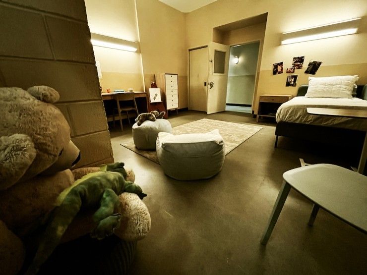
CompWare’s main permanent set exterior façade has a cavernous entrance that evokes a prison-like cave. Just inside the main set, the color palette is a mix of stark and subtle coloring, emphasizing tones of gray and intentional red alongside yellow enhancements. A large set element is the wall of monitors which structurally holds the monitors in a way that resembles the concept of prison bars. The ventricular glass creates that same prison bar sensibilities with the lined obscured glass that appears throughout our main set.
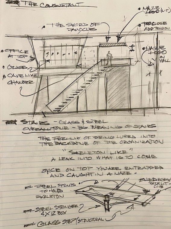
As I mentioned, the logo and other graphics containing a labyrinth maze are a subtle clue into how employees feel internally as our story unfolds. A large graphic, which follows this theme, can be found behind the staircase and over the top of the stair as a light fixture is emphasized as a key element within the space. Finally, the main stairs in the lobby are an insecure, seemingly unstable steel spline and glass structure that is like navigating on a knife’s edge of fear.
My concept was to create something shiny and modern and then pull you into a maze where you’re caught off guard, not knowing which direction to move in or where you are in this environment (a nod to The Shining). It creates an unbalanced, unstable, and seemingly unwieldy sense of dread, causing the characters to enter a cave or a dungeon. It is evident in the jewelry store.
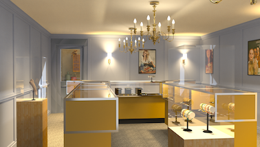
The front of the store is shiny and modern, but the smelting room in the back resembles a dungeon or prison, which causes desperation. Another example is the route from the elevator to the record room with a server room in the middle. You see decaying walls as you move through the maze of servers, contrasting the modern and sleek main office interior.
The servers were set up as a maze or labyrinth to mimic the CompWare logo, and the lighting in the servers was designed to emphasize the difference between the characters that move throughout it. Another opportunity to create an uneven precarious surface was the glass and steel staircase leading up to the perched office, where the only way to stabilize yourself is by looking at the unsettling object that makes you uneasy in the first place. In this case, it is Patoff.
With as many environments as possible, I was very conscious of making sure that you couldn’t move through the space directly by always putting hurdles in the way and adding jarring breadcrumbs along the way to enhance the unsettledness the characters feel. One of my favorite examples is the sequence in Season 1 Episode 3, Friday. Craig (Natt Wolf) and Patoff start their evening at Chippers, a down-and-dirty dive bar, and move to the shiny object of the Sky Bar that Patoff invites Craig to.
As the characters move from the contrast of Chippers to the Sky Bar, I paid attention to give the audience clues into the future. Before presenting the bar itself, I wanted to present a small environment, the elevator, and a dark space, the chamber outside of the club. Those spaces included small nods to the main themes as the hostess’ circular podium made of prison-like gold bars.
Then the Sky Bar itself is a vast open wide space with lots of shiny objects and a massive contrast to the dive bar we just came out of. We used a color palette of blue and gold with red drinks, giving a clue into who Patoff might be. The blue is representative of the concept of sadness. I even created a blue crying tree that only appears for a second on screen, but it typifies what is going on internally for Craig as we move further into the story.
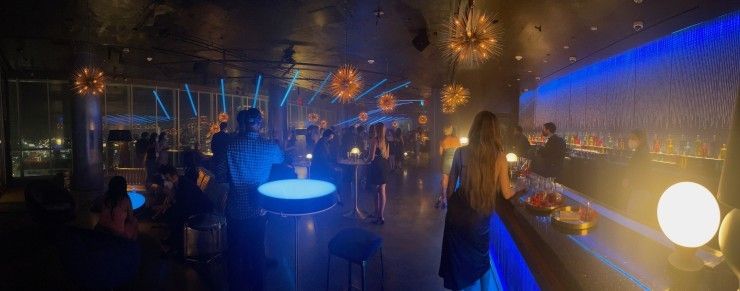
Behind him, I also placed a gold cage light fixture resembling gold prison bars, and the daggers over his head represent the sword of Damocles. The gold is a clue into who Patoff is internally, the links of how far we may go for success, the jeweler, and the final skeleton in the game.
The production design propels a story forward overtly or covertly, so it’s more about distinguishing which is more salient at the time and will move the story forward. It’s even more critical in horror/thriller storytelling, where one needs to feed these facets to the viewer correctly.
For example, in The Consultant, we toyed with the idea of war-torn architecture and leaking water like in a torture chamber. These key thought patterns evoked the underlying nervousness, and uneasy emotions conveyed in the story. The production design is a delicate balance in learning that things can be better caught than taught. Sometimes good design is silent, and sometimes it needs to be in your face to help you understand the deeper meaning in this sculpted three-dimensional space that we, as viewers, experience.
My chief desire was to execute visual eye candy in a way that allows the viewer to experience the conveyed underlying narrative viscerally. Our medium is powerful when we get it right, as we bring a certain level of understanding to the table as designers that help us understand these worlds and stories a little better. For me, it’s about making sure there are as many thoughtful, meaningful, and storytelling layers of this idea as demonstrated throughout the landscape of each frame.