[This story contains major spoilers for Nimona.]
Nimona voice actress Chloë Grace Moretz “loves” that pink is the sole color embraced by the titular shapeshifting hero behind the Netflix animated film.
“When I was younger, I shirked pink like crazy. I remember being like, ‘Pink’s not cool. I’m going to wear everything other than pink,’” she recalled on the pink carpet of the movie’s New York screening. “Then I grew up, and I was like, ‘I can wear pink. I can do this.’ Those colors were gender-neutral for many years until like the 1940s. It’s a color that I think we should gain more ownership over and be able to wear it whenever we want it, however we want it, in all its different shades.”
In America, pink is a color that has spanned the gender spectrum at various points in history, having spent decades not being associated with any particular gender, before being ascribed in the 20th century first as a masculine and then, later, a feminine color. But with the new Annapurna Pictures film, which debuted on the streamer June 30, pink is associated with only a single binary-breaking character in this inclusive action-adventure that co-producer ND Stevenson says has “always had this transness and gender fluidity at its heart.”
“Growing up AFAB [assigned female at birth], everyone is always like a pink, pink, pink. As a kid, I was like, ‘I’m not like other girls. I hate pink. No pink for me.’ Then, when I was designing her, I wanted to reclaim pink in a way that I liked,” Stevenson, who wrote and illustrated the award-winning graphic novel Nimona is based on, told The Hollywood Reporter. “It was one of those stereotypical tropes that I just wanted to turn on their head and make it something totally new.”
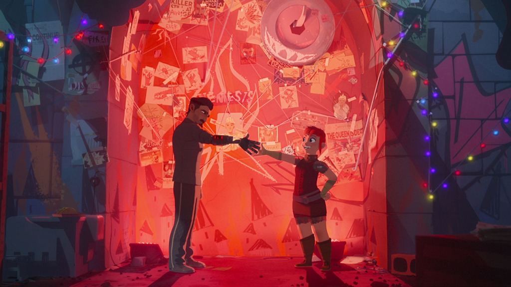
Ballister Boldheart and Nimona in their evil lair.
Netflix
In the comic, which sees the fiery shapeshifter team with knight Ballister Blackheart (Riz Ahmed) after he is accused of a crime, Stevenson embraced pink as a way of shirking gender expectations around a character he previously described as a personal power fantasy. But the award-winning comics writer also used the color more practically, as a way to “track Nimona through the comic when she’s always changing shape.”
“You can’t literally watch her transform in action. You have to watch her move from one panel to another. So pink was a way of saying this rhino’s Nimona, so you always knew where she was. But she also starts subverting that,” he told THR. “Really, she doesn’t actually have to turn into pink things. At a certain point, she changes her hair color to purple. It’s really shocking because we always assumed that she had to have that color [pink], but she chose it. It’s something that starts questioning what we think we know about her, and what her default really is, and we realize she doesn’t have one.”
On Nimona’s journey to becoming a film, Stevenson said the color shape-shifted again to represent “acceptance, loving yourself and being true to yourself,” alongside themes of hope and self-expression. “When she becomes a shadow monster she loses that color, but when she’s accepted, she turns into a being of pure light and pure pink,” he explained of the film’s climax. For co-director Troy Quane, pink serves throughout the film as a visual signal of a hero whose “bold, bright, noticeable color” embodies a refusal to conform to anyone’s expectation.
“Pink represents individuality. She’s a character who could be anything or anybody, but she wants to make sure that you know who she is and that she chooses the form that she’s taking, whether that’s the teenage punk we’ve come to love and know, or whether it’s a giant rhino or a dragon,” he said. “It really is a way of saying, I’m not going to conform. I’m not going to do this by anybody else’s standards. I’m going to be unapologetically me.”

Ballister Boldheart and Nimona as whale in the Institute.
Netflix
Pink isn’t the only color the Netflix animated film uses to make a statement. Like Stevenson’s comic, a palette of shades is part of the film’s visual language, in a story that explores the “classic princess fairy tale versus futuristic dystopia,” according to Aidan Sugano, a production designer and the film’s art director of characters. Where the “salmon” pink represents Nimona, acceptance, freedom and change, “classic hero colors” like gold, white and blue stand for non-acceptance, social rules and the Institute’s rigid ideals.
Blue is also a marker of the kingdom’s royal social class, while green represents the fusion of technology and magic in Nimona’s techno-medieval society. But the film’s starkest color representation comes in the form of the white and gold of Ambrosius Goldenloin (Eugene Lee Yang) and the black of Ballister Boldheart, two knights, former boyfriends and now seemingly (reluctant) enemies, who — along with the Director (Frances Conroy) of the Institute — explore storytelling’s long history of tropes around colors both light and dark.
Leaning into Stevenson’s own interests, which frequently center around the themes of good versus evil, hero versus villain and “the ways that that is not always what it seems to be,” the movie’s art team call up audiences’ stereotypical color associations to uncover who characters “really are versus who we think we are,” according to Stevenson. That’s alongside efforts to visually define (and redefine) power, illustrate societal control and even externally portray a character’s internal development.
“These characters were all representations of the two opposing ideologies in the film, so we structured everything off that shape language,” said Sugano during a press day for the film. “That was instilled in the environment design and the costume design, and in the form of color through our lighting.”
Ahead of Nimona‘s release, THR spoke to Sugano about this and more, including how the film uses color to not only express but subvert Western animation’s gender, power and color binaries, stereotypes and expectations around its heroes, villains and society.
Pink is Nimona’s primary color. What was her specific pink, and what was the breadth of pinks the team was working with?
There’s one “hero Nimona pink,” which we leveraged off of the pink ND [Stevenson] used in the graphic novel as a starting place. We had to do some tweaks for the film space, but we have burned into our heads that Nimona pink is Pantone 2348C. That pink specifically is very tricky from a cinematic perspective because it very quickly, depending on the light conditions, can change. We were managing a lot of the perceived color. So we had to make sure that in a situation where it started to skew more purple and that wasn’t actually feeling like Nimona’s color, that we shifted things back. And when we were using pink, it was very geared toward illustrating a specific beat. Because of that, there were like 10 different pinks, and also things that felt like pink that we used adjacently. Red is a color that we found really quickly and came to also represent her in that way. It fit this spectrum, this range, of that Nimona color, which make sense with the theme too, because Nimona isn’t this one thing. She’s this spectrum of things that change based on the situation.

An Institute knight and Nimona as a rhino.
Netflix
Pink has a specific trajectory in the U.S. in terms of gender expression. Nimona’s specific pink is a bit bolder than a pastel, the latter of which can evoke a more feminized interpretation. How did you think about the spectrum of pink with this character and the film to reinforce this binary breaking character?
She is this complex character, so having her only be one single shade never felt right. It goes against literally everything she is. But we were doing so many others things in the world to normalize gender expression. From the standpoint of the society, colors were tied less to gender and more to class. For example, with our [background] characters, we were leaning on sumptuary laws from the medieval era. We were reserving certain colors for certain echelons. Our nobles could only have certain colors in this limited palette, plus white, black and gray, and it was all in the more bold, primary space. The citizens’ colors, which was the majority of the population, were a lot broader. There were neons and colors that could be associated with athleisure wear. Then with the bottom end, the peasants, things were a little bit more desaturated, more hand, organic, natural dye based because of the materials they would have had at that point in time. But we didn’t really assign color to gender, even in our background tool. This applies to our clothing design as well. We set up a system where there was not really a delineation from an expression standpoint, as men could only wear these garments or women could only wear these garments. It was across the board, if a guy wanted to wear a dress? Good. He wanted it to be pink? Excellent. It was built into the foundation of how we treated this society. I don’t want to say gender was not a thing, but the issues that we have around gender in our current society were way different than in the society that we built.
Red emerges in different situations, including things like juice, fire, the kingdom’s warning signs and blood. Some of those things have much scarier connotations than Nimona and her pink. How did you work to distinguish those moments of red from the moments of pink, particularly when Nimona’s treated as something to fear?
We were fighting against, at least in the Western world, the emotional reaction that those kinds of colors have. And honestly, we were playing with that purposely with the villain trope versus the hero trope. We were using a lot of those colors — the red, the black, the abrasive combination of those — to put you in that headspace purposely and to then flip things on its head. Whenever you are with our heroes who are seen as the villains, we’re living in the villain color space. Making sure it played into those fears — that emotional reaction — was the driving force behind that red. You had that visceral reaction at the beginning, but then the characters on screen, their personalities start to change as you move through the film, so we were able to flip the emotional color. When you saw that red or that black, it might still give you that visceral reaction, but it was, “Oh, we’re with the characters we love.” Whereas you see gold, white and blue [of the perceived heroes] — it’s bright and shining — and you’re all of a sudden, like, “Oh no, the knights are here.” We were very much speaking to the graphic novel. It was a purposeful choice to play with the tropes in order to play with audience expectations.

Ballister Boldheart and Nimona.
Netflix
The movie’s color play feels most obvious when Nimona becomes the shadow monster before transforming into that intensely pink phoenix creature. In this moment, black seems to evoke fear, hurt and pain while the creature’s inner light — which is more white — leans into more positive color stereotypes. Can you talk about reinforcing color stereotype before eventually subverting it in this sequence?
That goes back to the concept that we used as our master rule for all of our lighting and color choices, which was the light and shadow concept. We wanted light to represent acceptance, but also it had this dichotomy in there that was exposure. Because when you’re in the light, you’re also at your most vulnerable, your most exposed. The reverse is that the shadow represents nonacceptance, concealment — whether that’s a purposeful choice by the character to not want to share themselves or whether that’s being forced on them by society or another external force. So when Nimona becomes the shadow creature, she has that glowing heart, that glowing white light that represents the acceptance that she just so desperately wants first from this one person and then from other characters. Then when she has that trauma when Ballister cut ties with her — where he pulls the sword to show that his feelings haven’t really changed, and once again, she’s betrayed by this person that she’s put her trust in — that’s where we literally turn her into a visual representation of the opposite of that light and acceptance.
We turn her into a creature of shadow, whose essence sucks light away. At the same time, she has this shell of roiling oil fire, of black smoke, that is concealing this heart inside. We always thought that this trauma was so powerful that it actually almost burnt her away. Those emotions were so strong that it burned her into this creature of pain and isolation. When we first see it, we wanted to play it so that you can actually see the creature when it started walking forward, and it just starts blotting out the stars — they’re disappearing first before you actually see the character’s eyes open. We wanted to set her in a place that was pitch black with a few points of light and even pull those out and destroy those because it’s the lowest point of this character’s journey in relationship to that concept of light and shadow, acceptance and non-acceptance.
Black is more explicitly Ballister’s color, but it operates uniquely with pink, which functions across the film as light and shadow in many scenes — a space that black would normally help occupy. How did you think about black in terms of the character, but also environmentally when you’re already using so much pink?
Carefully. (Laughs.) Because it’s an animated feature, and it’s geared toward a specific audience, there’s always this concern of going too dark. We knew very quickly that we wanted to throw that out because this idea of color was tied to the story. We did have to maintain a little bit of it just to preserve lighting, so it didn’t flatten out and crunch together, but the main reason that we needed to choose black goes back to the graphic novel. Ballister had to represent that villain. It leaned into those visual tropes where black has been historically used as the color of evil, especially in the West. It is perceived as dark and scary. In the graphic novel and in this film, [Ballister’s] the black knight. He is supposed to represent that villain, not only as the outsider in the society, but also the classic villain trope. In the graphic novel, he was assigned the role of villain, and in the film, he was assigned it in a different way, where it was foisted upon him. What we needed to do is make sure that we were using it to turn things on its head again. Yes, black is usually referred to and known as a color that represents these very specific things, but those are a label that’s being put upon it.

Ballister Boldheart in Nimona.
Netflix
In regards to how it interacted with pink, Nimona led more than Ballister did, and that influenced our use of it. We have these two tent poles — the use of color and our use of light and shadow — and Nimona’s color pink was a purposeful hero choice storytelling-wise that had to be considered first before we considered Ballister’s color, and then had to be considered with the idea of light and shadow. Also, the pink, obviously, does represent light because it’s a lighter value of a color. As soon as you start pulling that down into a darker value, it’s just red or burgundy. We use that pink more so in moments tied to Nimona, when her voice and spirit — that idea of acceptance — needed to be present in that moment. When she shares a moment with Ballister under the overpass, and he’s pulling out the arrow, when they first land it’s in one kind of pink space and by the end of the sequence, it’s in Nimona’s Pantone 2348C. It has shifted because the scene started in a place where the characters are disconnected and Ballister is not ready to accept something, and then he realizes his own flaw and faults while poking and prodding. They have that moment of connection, of togetherness.
Still speaking to shadow and light, it’s a space we might see gray typically occupy in the white-black color binary. But it’s mostly associated with the Institute, the knights,’ the suppressive, towering city walls. And with the director, gray isn’t just in her outfit or her office, but literally in her eyes. How important was that color to illustrating the film’s messages around power, control and fear?
We never really assigned a meaning to the color, outside of the use of light and shadow. Gray was more important for these characters and their relationships to be seen through that idea that there are many shades of acceptance. But I love the metaphor you said about the wall. A lot of that stuff I think wasn’t purposeful, but because we have this general structure, that comes out. Also, in thinking about the tropes in the separation of colors, we had Nimona’s color as one side of the spectrum. Then we had the classic hero colors on the other side of the palette — white, golds, blues. White was an interesting thing because white became shades of gray in how we had to use it, to do our environments and our characters. You couldn’t just put white on the screen. It’ll blow out every single time. You won’t be able to light that. So even though the Institute, the wall, all the statuary is white, they’re all really shades of gray because they have to be. It’s marble and cement and other things to fit within that color palette of white, gold and blue to go with that white knight vibe.
The director has gray on her, but we tried to keep her as white as possible, to push her as close to that upper spectrum as possible. The director’s eyes — and remind me to talk about eye shapes later — are like blue gray. The director’s dress and Gloreth, all of those were purposeful choices to land in that space, too. When Nimona and Gloreth are walking in the flashback through the woods, there are blue flowers. The reason why Gloreth’s hair is gold, and her dress is blue, is to represent all of this ideology that the Institute needs to function as within the story. Same with the Director. She’s the epitome of that, so she’s the white dress, gold diamonds, gold hair and pale complexion. Even her office, there’s nothing dark in it whatsoever. It’s white, gold and blue. In the scene where she reveals herself as the villain and stabs Goldenloin, we didn’t put a single shadow in that entire place. Everything was super bright until Ballister steps in to reinforce that ideology that needed to sway.

The Director (voiced by Francis Conroy) and Ambrosius Goldenloin (voiced by Eugene Lee Yang).
Netflix
That happens a few other times. When we show Goldenloin at the end of the third act, and he steps out in front of the bikes — full frame backlit by the headlights — it’s all blue, and he’s gold. The next frame we’re seeing Nimona’s shadow creep into frame because it’s a colliding of these two ideologies. In the beginning when the queen is killed, Ballister goes last into a stadium that’s all gold, and the lights go down, and it’s blue and white until he shoots the queen. Green gets introduced as an abrasive color before lights go down, and it’s black. That’s how we used the gray. We kind of separated the binary to say, if it falls above 75 to 100 percent — that lighter gray to white spectrum — that’s the Institute. If it falls below that, it falls within the light and shadow piece.
You mentioned green, which also makes a few appearances, mostly in relation to the Institute and its weapons. What’s the differentiation here between the green and white-gray? And what does that mean for the use of green in character like knight Todd’s eyes?
In the graphic novel, there’s jade root and it’s green. For a lot of the film’s versions, jade root was a huge story point because in the comic, it’s the only thing that Nimona is kind of vulnerable to. It sucks away her powers. But as they did more drafts, they kept getting notes where people needed it explained, and they felt like it was distracting. So they took out the larger concept of jade root, but we kept it in the story as the color of the weapons that cause all of this pain, evil, hurt and trauma. That is why when you get to the weapons that are tied to character related plot moments, they’re all green. Ballister’s sword is green; the Director’s scepter is green; the cannon at the end is green — even though all of the Institute weapons are blue.

Riz Ahmed as Ballister Boldheart in Nimona.
Netflix
That was a purposeful choice to make sure that we knew that this is the weapon that is going to cause the most amount of damage, and you can ascribe whatever meaning you see in there. So it was derived from the concept of jade root, but then it becomes this ambiguous motivator. When you see this, it’s because this is a moment that is going to be forced on our characters that is outside their choice or that acts as the epitome of this nonacceptance. Now, having Todd’s eyes be that tint, he represents another one of those characters that’s not as bad as the director, but he’s living in this bigoted space and is going to be very, very difficult to change. He’s a weapon of that opposing ideology to Nimona. That’s what all of those weapons are, that opposing ideology come to life.
You mentioned the character’s eye shapes earlier. Can you elaborate on that?
Pay attention to the highlight shape in the eye. Because the shape that we had for the actual highlight — the eye-ding, the little white speck — was specifically designed to be different depending on the ideology that was present at that moment of the story. So if the Institute’s ideals were flowing and the director was giving her speech to all the guards in the room, everyone had diamonds in their eyes. In the beginning, in the locker room, when Ballister still believed in the Institute ideals, he has diamonds in his eyes. When he becomes himself a little bit later on, it changes to a square because that was the shape that we assigned his character. Later on, when Nimona is influencing him, we put the Nimona shape in his eye, which is a little flame. If you go back with a fine-tooth comb — and there are a few areas where we missed because that just happens (laughs) — sometimes they switch, too, depending on what is happening in that scene. That also goes with the lens flares and any of the lighting camera effects. You’ll have a lens flare that blasts across the screen, and it’s in the prison where the director has the power in the scene — it’s all diamonds.
Interview edited for length and clarity.
Nimona is currently streaming on Netflix.