Long before we had film, we had colour, and artists throughout history have leveraged this fragment of beauty to add emotional and symbolic layers to their art. From the soft, gentle palettes of the Impressionists to the dark and obscure Tenebrism, it’s difficult to miss the way that colour shapes our perception of art and life itself. Still, the introduction of film invited us to a whole new dimension, one where stories and colours could evolve and transcend with a moving picture, luring and foreshadowing, and taking us on journeys through time.
In this way, colour in filmmaking is the ultimate subliminal messenger, inciting emotions without eating into run time or patronising its audience. Colour gives room for creatives to quite literally paint a picture with their narrative, adding depth, symbolism and clues as the story unfolds before us. As a result, creating a thoughtful and intentional colour palette is one of the most powerful tools a filmmaker can have in their arsenal. In this article, we’ll show you how to do just that.
The Psychology of Colour
It’s tempting to think of colour as a universal language, but in fact, the way that we perceive and interpret colour is deeply rooted in our social and cultural experiences. It’s even been shown that different cultures are better equipped at distinguishing between different hues depending on the language they have to describe them. Russian speakers, for example, are considerably faster than English speakers at discriminating between blues as their language denotes two separate colour names for light and dark blue. Even more strikingly, the Pirahã people of the Amazon rainforest have no words for colours at all. Less so a language itself then, colour is simply a fragment of reality, experienced universally but inescapably defined by our independent cultures.
In this way, the associations that we have with specific colours have been built upon thousands of years of tradition and language, so it’s easy to take their “meaning” for granted. But as we span the world, we see these instinctive associations fall apart like the constructions that they are. White, for example, is generally associated with purity and peace in the West, whereas in parts of Africa, it represents illness, and in East Asia, misfortune and mourning. Similarly, across Asia, orange is a colour of prosperity and good health, whereas in the Middle East, it signifies danger and loss.
Even within the West, colours can be used to signal a range of contrasting meanings. Green is often used to represent fertility and nature, but it’s also commonly associated with sickly or toxic undercurrents. Red can evoke a sense of both danger and love, whilst yellows are used to convey both joy and madness.
This isn’t to say that these associations aren’t real, just that they’re fickle and changeable according to where you are in the world. Colours may incite a range of different feelings depending on who is perceiving them, which isn’t necessarily a bad thing – after all, art is meant to be an interpretive and personal experience.
There are, however, some prevailing natural associations that could be considered more universal – red, like fire, is warm, whilst blue, like water, is cool. It’s unlikely that any audience would have felt Jack and Rose’s cold so much in The Titanic (1997) if James Cameron had opted for a red hue as they clutched that door in the middle of the Atlantic ocean.
But of course, for most of us, this isn’t the only effect that it has. The use of a dark, cool blue on the screen evokes feelings of isolation and melancholy. It’s a layer that reaffirms how we already feel about the story on screen. This is why context is so important; tell your story through narrative then reinforce your audience’s emotional response through colour.
Understanding Colour Theory
Of course, it can be helpful to lean on the established meanings of colours within your culture, as this will allow you to tap into the existing associations of your audience. However, it’s the way that you use colour rather than the colours themselves that have the greatest influence on your filmmaking.
At the end of the day, you can’t bank on the fact that your audience will all be wired to read your association between green and envy, but they should all have the same understanding of how patterns inform analogy, whether consciously or not.
Unlike the fluid meanings of colours, the fact that our eyes are drawn to things that stand out is intrinsic, as is the way that we interpret the connection between things that share features, and opposition or distance between those that don’t. Below we’ll go over how to leverage these patterns by using colour theory in your film.
Discordant colours
Discordant colours are those that deviate from the film’s standard palette and can be used to unsettle the viewer or signal to them that this is a moment or element of distinct impact on the story. Viewers will notice when something doesn’t fit in, particularly if you’ve been consistent and intentional about your palette, so this can be a powerful tool if you want to draw your audience’s attention towards a specific scene or object.
Saturated hues typically represent intensity and extremity, and as a result, are often used as discordant colours in filmmaking. They stand out well against muted hues, which are typically associated with stagnancy and dissociation. The most famous and exaggerated
example of this is in Schindler’s List (1993), a black and white film that reserves colour for the red coat of a young Jewish girl walking past the slaughter of her community, drawing the eye of both the audience and the film’s protagonist. We later see her red coat on the back of a cart transporting dead bodies, drawing attention to the loss of hope and innocence.
Associative colours
Associative colours are those that are linked to certain events or characters and can be used to build a viewer’s emotional reaction by feeding them subconscious or subliminal messages about what’s about to happen (or reaffirming what already is). For example, Seven’s (1995) use of red and green throughout the film foreshadows its ending through the association of these colours with the final two sins.
These colour parallels can also be used to insinuate a different kind of connection or analogy between multiple aspects. In Blue is The Warmest Colour (2013), the colour blue is used to signify Adele’s search for identity and sense of self, colouring those places in which she seeks to find it, most notably in her love interest Emma, whose hair is blue at the beginning of the film.
Associative colours can also be used to signal unity or belonging, for example, if a character sports the same colours as their room or children (as is so often done in Wes Anderson’s productions), then this works to create a sense of harmony and coherence between the different characters or cinematic elements.
Transitional colours
Transitional colour schemes are where a palette gradually shifts throughout the film and can be used to reflect a transformation, often of identity. Characters that follow an arc of innocence to corruption are typically seen to go from pale, muted tones gradually towards darker or more sinister colours, such as Jack in The Shining (1980) or Walter White in Breaking Bad (2008-2013).
In one of the earliest examples of colour symbolism in the film, Eric Von Stroheim’s Greed (1924) depicts money and associations of wealth tinted yellow against an otherwise black-and-white palette, and by the film’s conclusion, this yellow hue has taken over the entire screen, signalling the all-consuming power of greed and possession.
Monochromatic colour schemes
Monochromatic colour schemes are where a single hue is used as a base for the palette, with tints, tones, and shades added for contrast and depth. Whilst associative colour theory uses single hues to draw links in an otherwise diverse colour palette, monochromatic colour schemes envelop the entire screen with one hue. Instead of insinuating a connection between elements then, this often gives the feeling of being trapped or overwhelmed.
This is why black and white films can lend themselves to the feeling that the characters and events are somehow trapped in time. The lack of variation in hues can evoke a feeling of uniformity and austerity; we’ve been stripped of the diversity and variation of colour, left with a finite and deficient perception of life. Robert Eggers says this is why his dark and hallucinatory creation of The Lighthouse (2019) had to be filmed in black and white, and why the Matrix’s (1999) persistent green hue evokes an unsettling tension within its audience.
Duelling or contrasting colours
Duelling colours or contrasting tones have the opposite effect, signalling a distance or conflict between two elements. This can be done to infer opposition or discordance between characters, as well as commonly being used to indicate the existence of different timeframes or ‘worlds’.
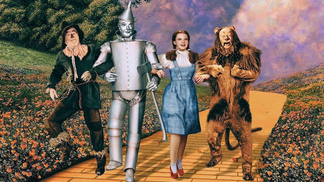
The Wizard of Oz (1939) famously used this technique to distinguish between the mundane, sepia-toned Kansas and the wonderful, technicoloured land of Oz. More recently, Wes Anderson’s Asteroid City (2023) flips between black and white and a coloured palette to differentiate between the two simultaneous plotlines, which follow the development of a play both on and off stage.
Creating a Colour Palette for Your Film
Now that you understand the essentials of using colour to create an analogy in your film, it’s time to put it into practice.
Identify your key themes
The first step is to establish the themes or allegories that you want to explore. For example, is this a coming-of-age drama about discovering who you are, or is it a cautionary tale about unrequited love? Think about the key themes that underpin the narrative and assign different colours to them and their opposing forces, and you’ll start to see how colour can naturally reinforce a story arc.
Take particular note of any overriding desires or oppositions within the narrative. Most story arcs involve a character’s journey from one state to another – what is it that your character is seeking in this transition? Love, identity, power, healing, freedom? This is your character’s north star, and an ideal opportunity to use colour to reinforce their pursuit. You can use associative colours to draw out the aspects of the film related to this theme, transitional palettes to reflect the journey of transition, and duelling colours to represent opposing forces.
Be selective
To create an impactful colour palette, you need to be selective. If you want a colour to be symbolic, then its usage has to be sparing. If reds were used more generously throughout American Beauty (1999), then its impact as a symbol of sex would be far less powerful. Of course, your analogies don’t have to be this in-your-face (and subtlety can go a long way) but it’s important that your audience has the chance to pick up on the analogies that you want to draw.
Moodboards
Mood boarding is a great way to envision how these elements pull together whilst you’re working on your treatment, and can help you to see the effects of your palette. Collect references from films and other visual media that align with the aesthetic that you want to display. You can add colour swatches to help track a consistent palette, and add notes about the colour patterns and techniques that you want to incorporate.
Consider your locations
Think carefully about the filming locations that you want to use for your project. Whilst costumes and props can easily be adjusted to fit your palette, your story may hinge on key locations that can’t be as easily adjusted. For example, if your story takes place in a forest, it’s important to consider how the colour green will interact with your story, and how it informs your use of discordant and transitional colour schemes. By aligning the colour scheme of your film with the locations, you’ll be able to create a more immersive and cohesive visual experience.
Conclusion
Colour is a crucial aspect of visual storytelling, and an opportunity to drive home key themes and emotions within your narrative. By applying different patterns of colour theory, filmmakers are empowered to reinforce the emotional response of their audience and add dimension and intrigue to their films.
Becky Tudor is the Content Manager for Tutti, a directory and booking platform for creative spaces. Combining her love for storytelling and an affinity for the arts, Becky enjoys writing articles on film, photography, music and beyond.