Color has a huge impact on how a movie is received by its audience. Imagine how different Wes Anderson’s movies would feel if they abandoned his trademark pastel color scheme (as the director himself proved with the black-and-white segments in The French Dispatch and Asteroid City). Or take the iconic Star Wars villain, Darth Vader. He might not be quite as menacing if he were bright green instead of beetle black.
‘Star Wars’ (1977)Credit: Twentieth Century-Fox
The choices that directors, costumers, production designers, and cinematographers make in this regard can change the meaning of a movie entirely. And among the wide variety of color palettes that are in the filmmaker’s toolkit, associative colors can be some of the most important.
What Is an Associative Color Palette?
Associative color palettes take the inherent psychology of color in film and kick it up a notch. Most people understand the basics of color theory, even if it’s on a subliminal level. For instance, most viewers could tell you that red is a passionate color that can represent love, blood, and warmth, at least in the Western world. On the other hand, blue typically represents sadness, coolness, or loneliness.
What an associative color palette does is tie one of those associations directly to a specific character or theme throughout a single film. This can be as simple as the color pink (which evokes childhood and a specific type of stereotypical femininity) being chosen to represent BarbieLand in 2023’s Barbie. But this can also get more complicated, to the point that specific colors or tones are reserved only for times when the assigned character is on-screen.
Why Use Associative Colors?
In film language, using associative colors onscreen can be just as effective as giving a character a musical theme. Colors can be attached to certain characters in the same way that, say, John Williams’ Indiana Jones theme is irrevocably attached to the image of a swashbuckling Harrison Ford.
This is true even when the characters to whom the theme is attached are not onscreen. In the Scream franchise, Hans Zimmer’s Broken Arrow theme is used to represent Dewey Riley (David Arquette), and [SPOILER ALERT] it crops up again in Scream VI, underscoring a scene where his ex-wife, Gale Weathers (Courteney Cox) is lamenting his death. Colors can be used in the exact same way.
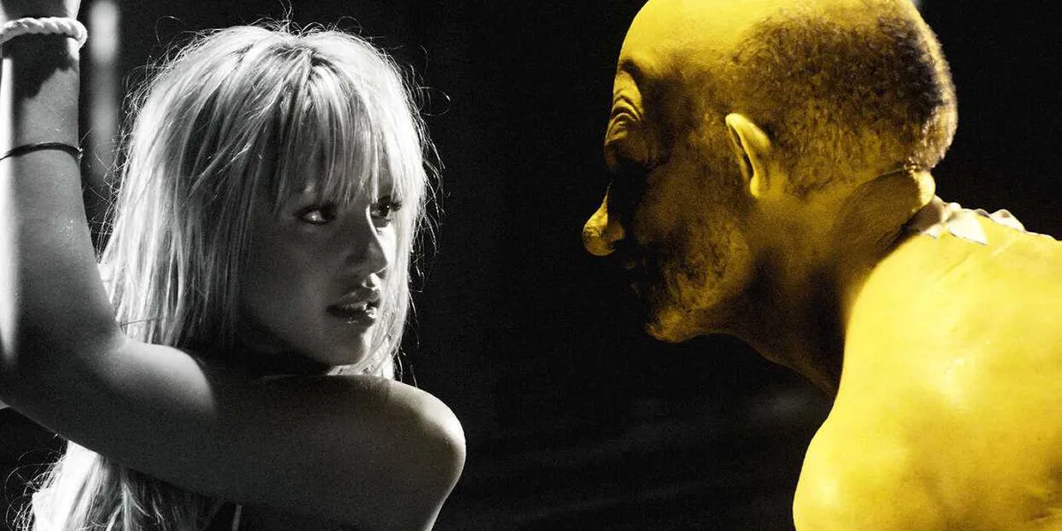
Robert Rodriguez’s 2005 movie Sin City is perhaps the most extreme example of this kind of color association. While the movie is primarily shot in crisp black-and-white, certain characters and objects are presented using bold colors.
 ‘Sin City’ (2005)Credit: Miramax Films
One of the most notable colors used on-screen is yellow, which is the color used to depict the disfigured Ethan Roark Jr. (Nick Stahl). The way that the bold primary color exactly refuses to fit the color scheme of the rest of the movie emphasizes how isolated the character is from the rest of society.
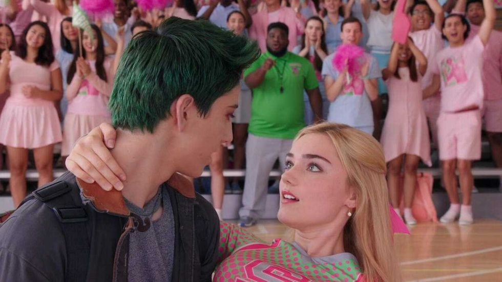
Just like team colors in a basketball game, associative colors can also be used to help audience members easily distinguish various characters or groups in a large ensemble. This is exemplified well by the 2018 Disney Channel musical Z-O-M-B-I-E-S. The movie is about teen zombies trying to fit in at a human school. While the zombies’ color palettes contain more earth tones, reds, and greens (particularly when it comes to their bright green hair), the “regular” humans at school mostly wear pastel blues and pinks, which also highlight their conformity.
The movie also furthers its themes with the school’s official uniforms. The football team (which Milo Manheim’s zombie Zed joins) and the cheerleading squad (which Meg Donnelly’s Addision – Zed’s love interest – belongs) wear uniforms with neon pinks and greens, boldly combining the two main color palettes and underscoring the fact that it is within these groups that zombies and humans will ultimately come to work together.
 ‘Z-O-M-B-I-E-S’ (2018)Credit: Disney Channel
Oscar-winning director Guillermo del Toro has used the trick of combining associative colors in a very different monster movie, his 2006 dark fantasy masterpiece Pan’s Labyrinth. In that movie, gold is the primary color used to represent Ofelia (Ivana Baquero) experiencing the fantasy world, while the scenes taking place in the violent reality of the Spanish Civil War are primarily blue. However, as the worlds begin to collide later in the movie, so too do their color palettes.
Colors Can Represent Just About Anything
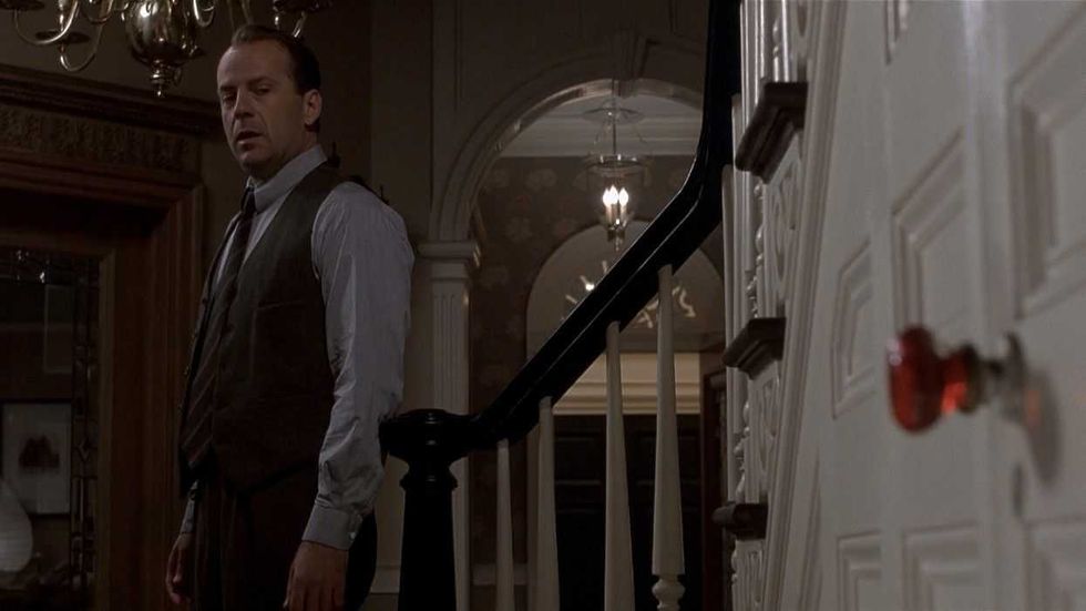
Filmmakers can get about as abstract as they want when it comes to associative colors. Take M. Night Shyamalan, whose breakout hit The Sixth Sense uses the color red very sparingly. Bright red objects only show up in scenes when a ghost is about to appear. In addition to reflecting the ghosts’ passionate wish to be understood and seen by the living, the color represents the violent ends that most of the ghosts have met.
Rather than using the color to represent a specific character, Shyamalan applies it to a group of scenes and ultimately uses it as a clue, hinting at the ending of the movie, which famously [SPOILER ALERT] reveals that Bruce Willis’ character has been dead the entire time without realizing it.
 ‘The Sixth Sense’ (1999)Credit: Buena Vista Pictures Distribution
In an even more abstract move, Francis Ford Coppola places oranges in The Godfather in scenes where characters are about to die. While the fruit has a number of cultural and folkloric associations that service the story, the color orange also serves as a warning color that is meant to alert the eye to potential hazards – think traffic cones and hi-vis safety vests.
It Can Be Extra Effective If Associative Colors Change
Some filmmakers take the metaphor of Pan’s Labyrinth and Z-O-M-B-I-E-S’ blended colors even further, not just combining the colors representing certain characters or themes, but outright swapping them in order to highlight key changes in the arc of the story.
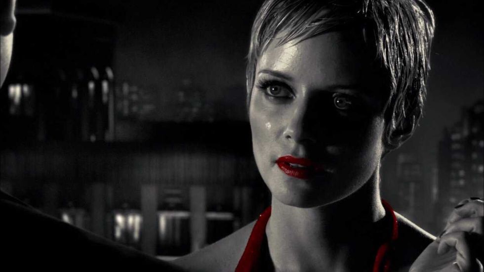
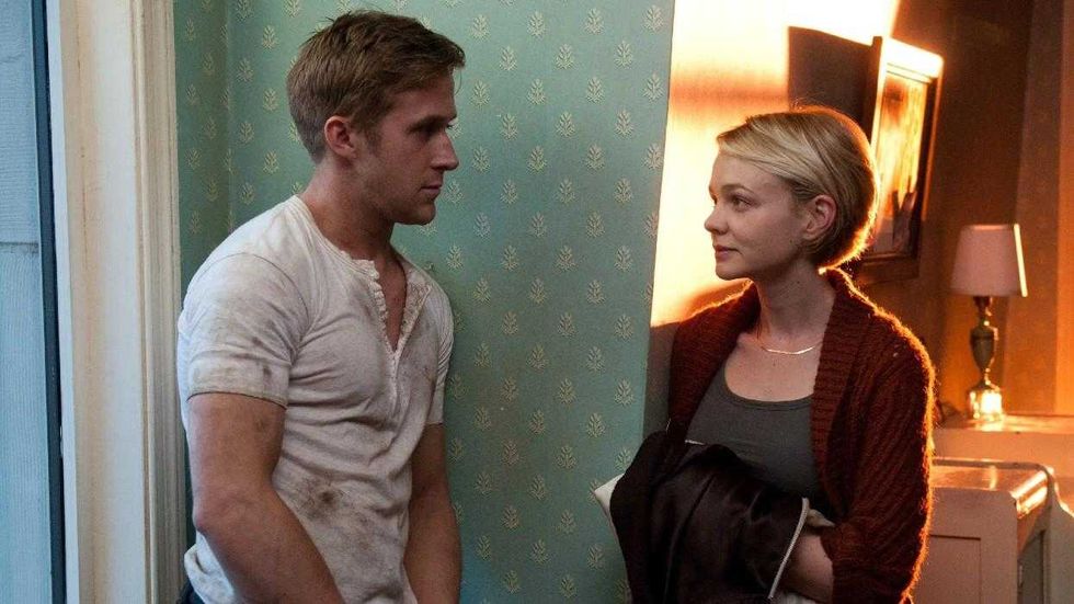
One notable use of this technique can be seen in Nicolas Winding Refn’s 2011 film Drive. For the most part, the violent and preternaturally calm The Driver (Ryan Gosling) is represented by cool tones, while his love interest Irene (Carey Mulligan) is associated with much warmer tones. This highlights the divide between their two worlds, and is sometimes even evoked within a single frame, like the one below:
 ‘Drive’ (2011)Credit: FilmDistrict
However, after a key moment where the pair embraces in an elevator, their colors swap. The Driver’s surroundings take on Irene’s warm tones thanks to his heart opening up through this loving, intimate moment. However, Irene’s subsequent scene takes on cooler tones as she is quickly plunged into the violent and uncaring world that her new beau occupies.
Part of the reason for this high-contrast look is the fact that Refn is colorblind. As he explained on the podcast Bullseye with Jessie Thorn, “I can’t see mid-colors. That’s why all my films are very contrasted. If it were anything else, I couldn’t see it.” However, because the director wields his colors with intention, it makes his images much more symbolically powerful as opposed to merely being striking to look at.
Though the moment is subtle, it proves that associative colors hold unique cinematic power. However, an associative palette is just one of the many types of color schemes that a filmmaker can use to great emotional effect. For more information on color palettes, check out No Film School’s library of articles, which includes information on discordant colors, analogous colors, and monochromatic palettes.