Often overlooked thanks to the ‘skip intro’ button, a great main title sequence serves as an entry point into another world. And this Emmy season has its share of series based on previous properties, which presents the main title designers with the challenge of linking existing inspirations with new stories.
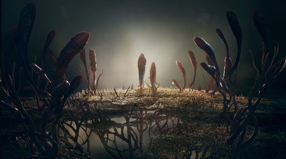
The Last of Us maps out a fungal network across the world in an evolution of the opening credit sequence from the 2013 video game. Inspired by Tolkien’s original works, The Lord of the Rings: The Rings of Power blends magic and science to create cymatic patterns. As a Game of Thrones prequel, House of the Dragon mirrors the previous show’s camera movements, but with a new focus on bloodlines.
‘The Last of Us’ Main Title Stills
HBO
The Last of Us
Following the 2013 video game, which had its own opening title sequence, it was important for creative studio Elastic’s main title designers Nadia Tzuo and Andy Hall to set their design for television apart.
“They wanted it to evolve in the same way that the show evolved beyond the game and be able to stand on its own merits,” Hall says. And those unfamiliar with the game, in which mankind is hit by a lethal fungal infection, needed to have that context. “They wanted it to set up the tone and the idea of what the show was about, but not rely on what people’s associations of the game was.”
While the video game’s title focused on the human impact of the fungal spread, The Last of Us series creators Neil Druckmann and Craig Mazin were looking for a title sequence that explored the growth of the infection itself. “They didn’t want to see any dystopia-cliché in the title,” Tzuo says. “They only wanted to see the fungus—how it grows, how it spreads and how it resembles a developing species.” The theme shows the fungus spreading and evolving into forms resembling manmade structures. “It’s like they’re thriving at the same time the human civilization is on a decline.”

‘The Last of Us’ Main Title Still
HBO
To achieve the appearance of organic growth, Hall and Tzuo did extensive research into how fungus grows. “We got elements from the show in terms of the aesthetic,” says Hall, “but Craig always wanted a look at the unique influence of nature.” This research allowed them to include a color palette mirroring the “acidic nature” of the fungus and to use the color to influence how certain things appear onscreen, such as creating a growth pattern that simulates a map of the United States.
The final product looks deceptively simple, though the process was actually complex, which Hall says is indicative of nature itself. “It’s what nature does so brilliantly,” he says. “It makes the complexity look simple in a way that is elegant and beautiful and refined. That’s always what we are trying to do.”
“Most of the time, our job is to simplify the concept down to, ‘What’s the spirit of the show?’” says Tzuo. “The title sequence is really like a book cover and it gets the audience prepared for the show and sets the tone for the story.”

‘The Rings of Power’ Main Title Still
Plains of Yonder/Prime Video
The Lord of the Rings: The Rings of Power
For The Rings of Power main title, Plains of Yonder designers Katrina Crawford and Mark Bashore looked to Tolkien’s creation myth of angelic figures singing the universe into being. “Tolkien felt that music was almost the center of the universe,” Bashore says. “That was perfectly in sync with our view of filmmaking, which is that audio can be more important than visuals.” The goal was to blend audio and visual together for the main title theme, having the music seemingly create the imagery.
“The idea of music creating something brought us to cymatics,” Crawford says. Cymatics is the natural phenomenon of complex patterns emerging through the displacement of small particles on a flat surface when vibrations are introduced. As the song changes in the main title, the particles shift into new patterns created through the vibrations. “It’s hypnotic and beautiful,” she says, “always shifting and changing… representing elements of transformation.” Using cymatic patterns created the perfect solution of something almost magical that is grounded in reality, which creates a portal into the world of Tolkien for the viewer.

‘The Rings of Power’ Main Title Still
Plains of Yonder/Prime Video
With such a storied world, it was essential for Crawford and Bashore to design patterns that would give a new viewer an idea of what they were coming into, but also convey a deep appreciation of Tolkien by layering in hidden meanings for the fans. “It’s beautiful for everybody, but it’s pretty deep in its meaning,” says Bashore.
“Ideally, we want to make it meaningful to everyone, whether they have knowledge of Tolkien’s world or not,” says Crawford. Given only 90 seconds to convey those ideas, she says the biggest question is how do they bring someone into a new world in a limited amount of time? “We’re not novel in saying that for us title sequences are a bit like a portal, right?”
Creating that portal is always a challenge, but Bashore says that’s why he loves designing the entry point into these worlds. “The psychology, mood and inner logic of a show really compressed into an abstract film is very fun to do and a huge challenge,” he says. “Some people don’t care about the titles and they hit the skip button, but we have found that a lot of people really do watch them, and I think viewers feel it when you do it right.”

‘House of the Dragon’ Main Title Still
HBO
House of the Dragon
Since Elastic’s Kirk Shintani was an integral part of designing the main title sequence for Game of Thrones, it made sense for him to return to design a new one for House of the Dragon. “Originally, we tried to find a balance between the story we needed to tell but we also had to be really aware that it needed to have some tie to the original show,” says Shintani. Set nearly 200 years before the events of the original series, House of the Dragon focuses mainly on House Targaryen and its line of succession once the king dies. “The concept boiled down to the family tree and how we show the relationships between the different members of the warring families.”

‘House of the Dragon’ Main Title Still
HBO
Though the design of the new main title sequence was more focused on a singular family line, it was important to incorporate some nods to the original. “There is a big thing that maybe people don’t consciously think about as Game of Thrones,” he says. “There is a specific language that we’ve built with these flyover cameras, moving from place to place, and that’s something we definitely wanted to keep in the show.” While the camera movements originally tracked locations on the map of Westeros, the new movements follow the bloodline of the Targaryen royal lineage.
“The world map was very much intentional of showing people where you are in each episode,” he says about the original Game of Thrones title. “Whereas for this one, the world’s already been defined and the key locators that we’re trying to explain aren’t locations, it’s the people’s positions in the family line.” The camera follows the blood flowing through a labyrinthine structure, as it passes through sigils of different family members and creates a root-like formation of the family tree.

Read the digital edition of Deadline’s Emmy Comedy issue here.
The initial challenge Shintani faced on the project was how to make the design feel like Game of Thrones without becoming a copy, but the focus quickly became about creating a main title that truly spoke to the story of House of the Dragon, and expanding upon that world. “One of the things that we really want to emphasize with our main titles, specifically speaking about House of the Dragon,” he says, “is that we wanted to be able to lean on the idea that the title changes every episode and gives the viewers something else to look forward to. We really wanted to add to the narrative of the show in our own little way.”


