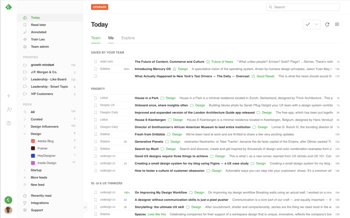
Here’s a quick demo of the new Feedly dark theme and left navigation bar updates:
More visible Add Content (+)
The profile and add content are now more visible in a left band. Team users will also be able to more easily add new teammates and share feeds and boards.
Pin or unpin
You can continue to pin or unpin the navigation bar
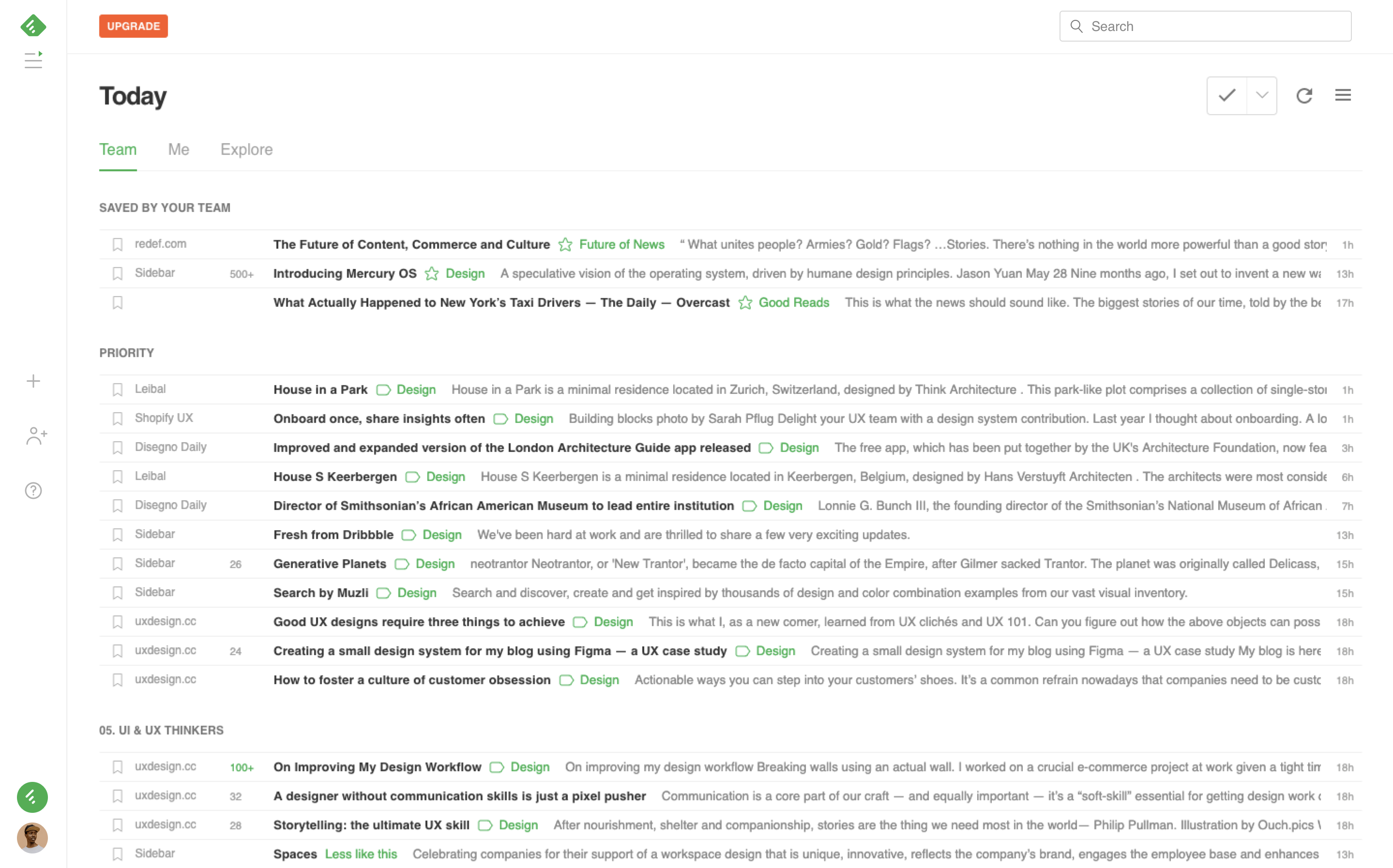
Right-click Menus
You can right click on a feed, a source, a board, or a priority and use the contextual menu to quickly manage your resources.
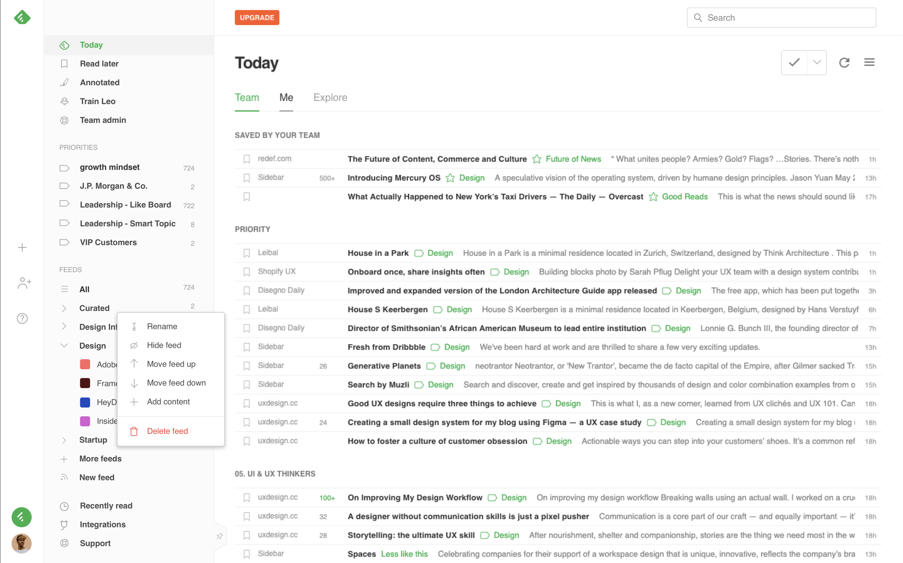
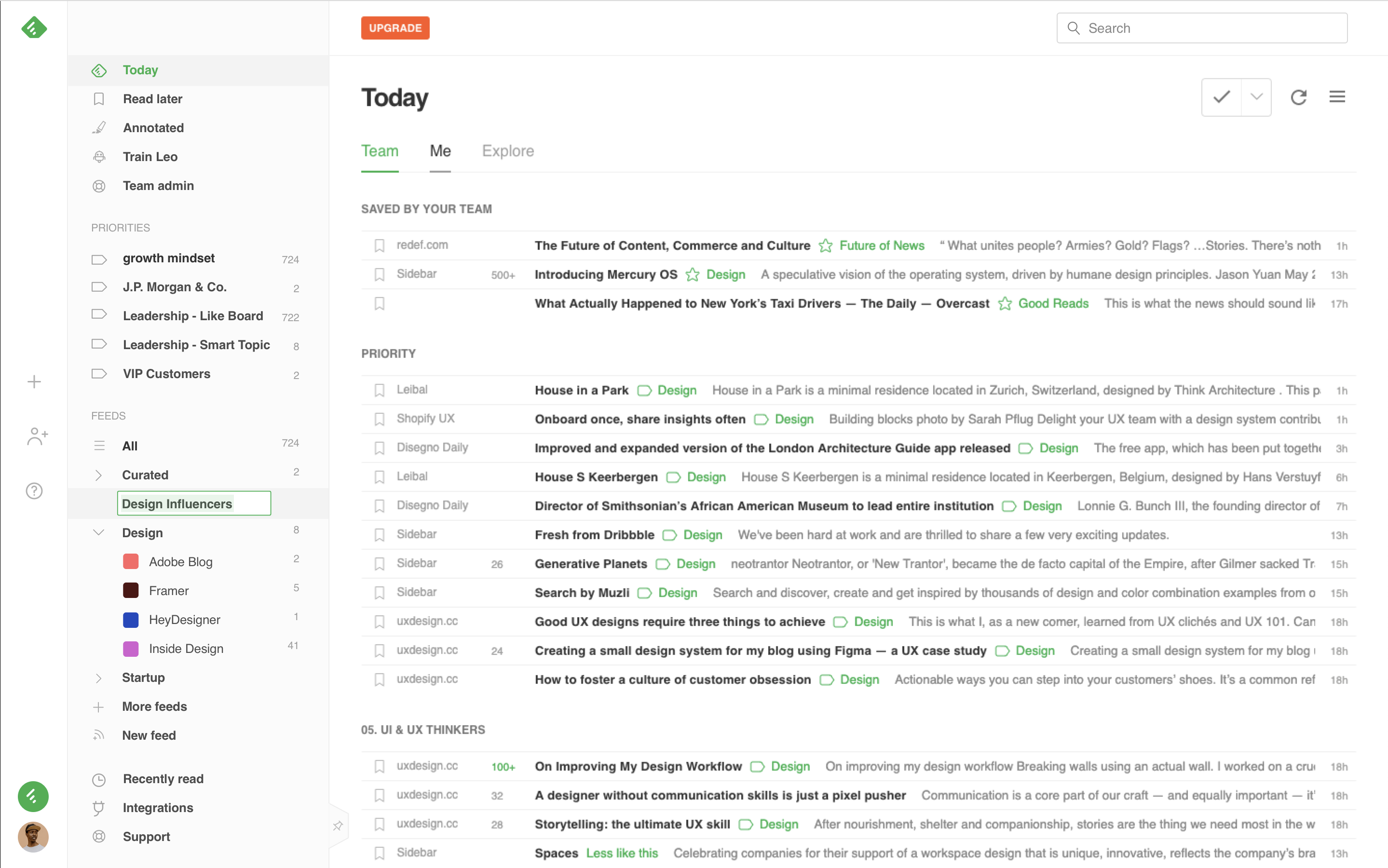
Easily rename inline
Renaming your feeds, sources, boards, and priorities is a lot easier.
Drag and sort
Drag and drop and easily re-order your categories.
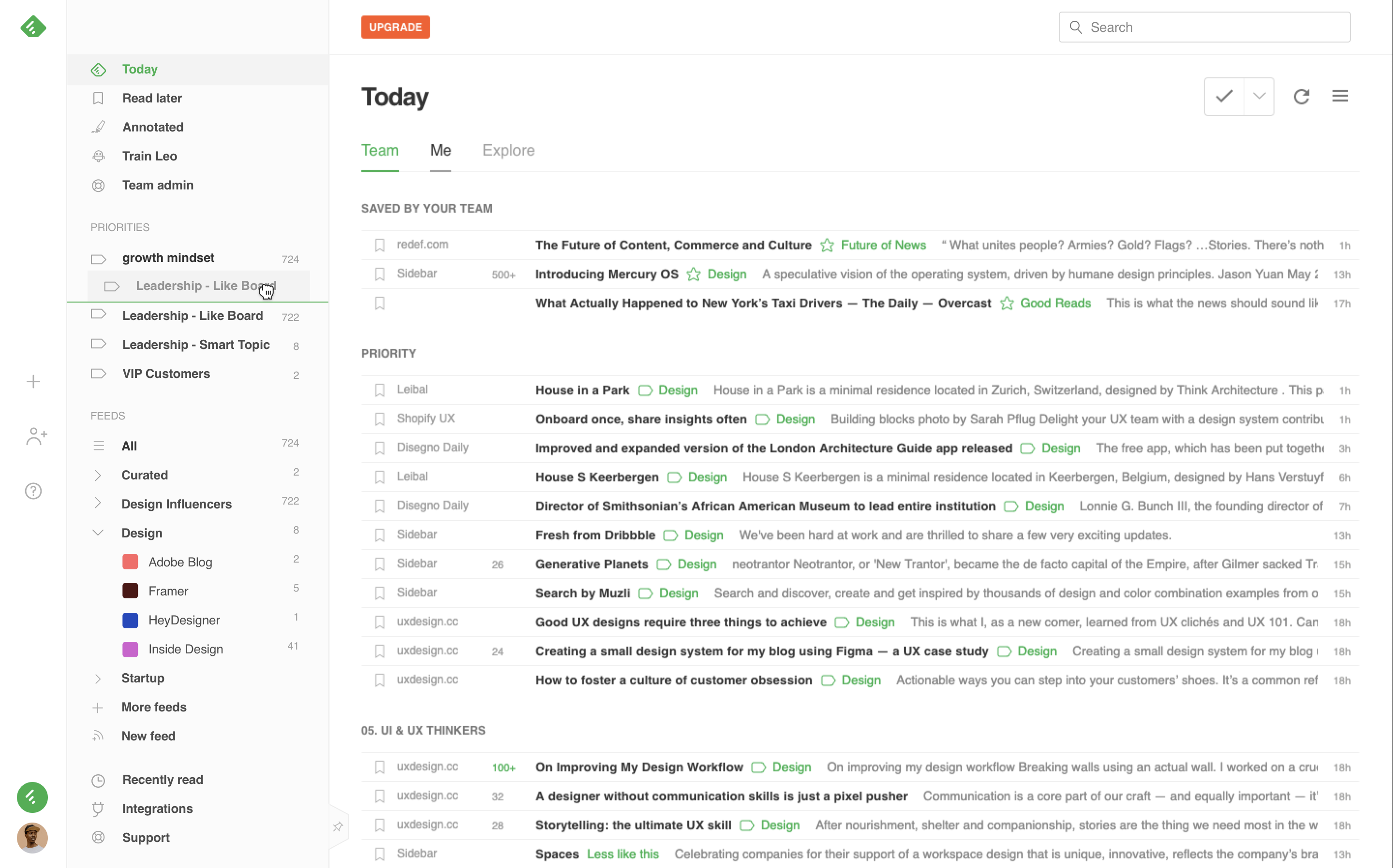
This impacts both the order in the left navigation and the order of the sections in the Today page.
A Cool New Dark Theme
The day/night icon on the left band makes it easy to switch from the default white theme to the new cool dark theme.

Thank you!
We would like to thank Gregoire Vella for leading the design of these two projects. We are very excited to have Gregoire as part of the design team. He has a really sharp eye and he is a pleasure to work with.
We would also like to thank the Feedly Lab community and Twitter community for all the bugs and suggestions reported during the beta.
We are continuously shifting to a more open and collaborative process. If you are actively using Feedly and want to share ideas or frustrations, please join the Feedly Lab Community on Slack or Twitter.
Happy reading!
-Edwin


