How did a NYC-based production designer find his way onto an indie film?
This post was written by James Bartol.
I got involved with Late Bloomers when director Lisa Steen and writer Anna Greenfield pitched the film to me back in early 2022. In selecting projects to work on, I see a lot of different scripts but I loved Late Bloomers right away, and the pitch deck they presented really caught my eye. Additionally, Francis Ha and Harold and Maude were two references they provided that really spoke to me, as a fan of both films. I knew I could design this film, and have a great time doing it.
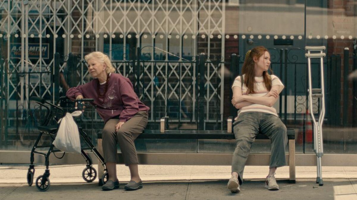
Late Bloomers is a New York story, and Lisa, Anna, and I, all having lived in Brooklyn, definitely bonded over that. Brooklyn has a visual language all its own that we could all speak together, and it informed many of the design choices for the film. I have designed films set in Brooklyn in the past, but in Late Bloomers, our protagonist, Louise, is such a specific and complex character I was really interested in what ways we could bring nuance to “Louise’s Brooklyn,” and began the exploratory process for designing the look of the film right away; a process informed by my experience as a Brooklynite and designer.
My Background
My background as a production designer living in New York definitely influenced my work on Late Bloomers. I’ve lived in New York for almost fifteen years, and you could call that experience “research.” New York is a character in Late Bloomers, and it’s a character I know well. I’ve been to those Bushwick parties, lived in those small city apartments, laughed and cried in those dive bars… These are all sets and locations in the film and I’d like to think my experience breathed a little extra life into them.
As for my previous work in relation to the film, I was able to pull some references from the feature film Cubby, by writer/director Mark Blane, which I designed back in 2016. The film has a similar “Brooklynite anti-hero” protagonist. I definitely kept in mind many of the design choices I made in that film as the design concept for Late Bloomers came together.
Mark, the lead in Cubby, and Louise, our lead in Late Bloomers, are millennial New Yorkers who are very different but are similarly “lost” in the world. It was fun to put together Louise’s visual world while considering how she and Mark intersected and differed.
A lot of these choices came through in the designs for their respective apartments – especially in their most personal spaces, like their bedrooms. I think so much of production design is pulling from your past work and your own personal life experience. It’s what keeps your voice distinct among fellow production designers and artists.
In the end, your distinct voice is going to inform every project, giving it its own narrative style, structure, and story origin.
Of course, doing this requires a unique, specific approach to every project.

How I Design My Concepts
Across the board, I prefer to start with the broad strokes of a design concept and narrow things down from there.
This usually starts with identifying the elements of mood, genre, and themes of the narrative as a whole, and considering what design choices we can make to support and contribute to those elements.
Personally, I tend to think about color before anything else. I like to build color palettes around each character, and though I may not know how these color choices will come into play specifically (and some of them may not at all), I find it’s a good starting point to start making design choices.
From there, I develop mood boards and sketches that use these color palettes and then start to articulate the textures and forms that are coming to mind for me – this is where things get more specific.
With these visuals in hand, I came to my first design meeting with Lisa, Anna, our cinematographer, John de Menil, and our producers, Alexandra Barreto, Taylor Feltner, and Sam Bisbee. Sketches and mood boards make for great talking points, and these conversations help steer me in the right direction, as well as lead to bigger more fully realized ideas.
From that first meeting, I could tell we were definitely all on the same page. As our conversations around the production design continued, I was able to put together what we call the visual “bible” for Late Bloomers. This contained all of our boards, sketches, palettes, photographs, and film references. I used this visual bible as a tool to relay these concepts to my art department, so we could all get to work executing these ideas on a more detailed and specific level while maintaining a certain cohesiveness in the design choices.
It also helped that I was lucky enough to be able to bring on some of my favorite art department collaborators that I already trusted and admired. Between my relationships with these talented folks and the show bible, we kept the whole department on the same page: from props to construction, to set dressing.
At the end of the day, every design choice, no matter how finite, has to support our story and its characters, while preserving the overall production design of the film. And it needs to be done speedily and efficiently because the nature of independent filmmaking demands speed and efficiency.
What Else Do You Need to Know About Design?
Designers need to be resourceful, and be ready to do some brainstorming and problem-solving with their collaborators. This kind of environment leads to a great deal of creativity, which can be so fulfilling.
One particularly memorable and fulfilling moment for me from the art department perspective was one of our set builds. We needed two different pharmacy locations for the film, and during our location scouting we were having a lot of trouble locking down both. So, a little late in the pre-production process, we made the collective decision that we would need to build one of the two. A full pharmacy set was outside of our scope, so we had to get really creative.
These kinds of puzzles excite me. I pitched the design of what you might call a “slice” of a full pharmacy set that would be doable for us.
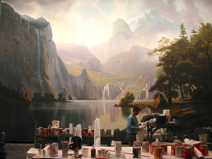
This involved some key set dressing to help sell “pharmacy” as well as some creative foreground elements, namely shelves and racks of store products. The set still needed depth, so we also utilized the old-school Hollywood technique of the “printed backdrop.”
I went to a local Walgreens and took some photographs of the store aisles, brought them into Adobe Photoshop to make some adjustments, then had the image printed on fabric that we could stretch and incorporate as the background of the set. The whole build was a risk, but between the design and some cinematography “tricks” of our very talented DP John de Menil, the set totally sells as a full pharmacy.
As someone with a penchant for old Hollywood techniques, this set was particularly satisfying to me.
Another lasting memory for me on Late Bloomers occurred on set while shooting. I don’t want to give any spoilers, but we were shooting a particularly emotional scene involving Louise with her guitar – those who have seen the film will know what scene I’m referencing. The performances of Karen Gillan and Talia Balsam were so incredibly truthful and touching that as I was looking around the set among our crewmembers, there was not a dry eye in the room.
This kind of experience on set is rare, and I know many of my colleagues on the film will remember this moment with fondness as well.


