SPOILER ALERT: This contains spoilers from “Barbie,” now playing in theaters.
“Barbie” Production designer Sarah Greenwood and set decorator Katie Spencer reckon that by this time next year, there will be a pendulum swing and no one will want to go near the color pink. But for now, it’s Barbie’s world and everyone, everywhere is obsessed.
Greenwood says Greta Gerwig, Mattel and producers Margot Robbie and Tom Ackerley gave her and Spencer a free hand when it came to building the world. “That was great and scary because it was like, ‘Oh, right, now we’ve got to go and figure it out,” Greenwood says.
With Barbie’s Dreamhouse, they weren’t looking to recreate the Mattel Dreamhouse — rather, they wanted to refine what that looked like. Says Greenwood, “We looked at the Dreamhouse over the past 60 years, what was in the script, and how to get the toyness of it. Subsequently, we learned Mattel had a term ‘toyetics.’”
In studying the vintage houses, they realized the doll inside the house was bigger and that “the scale was off-kilter. So we reduced everything by 23%,” says Greenwood. “When Margot is in the house, she could touch the roof and she’s too big for the car, and we set certain rules around that” and built their interpretation of that to bring Barbie’s Dreamhouse to life. In the house, Robbie would appear larger than in a real-life situation.
As with the majority of the movie, everything was built on soundstages with 360-degree sets which allowed Gerwig and cinematographer Rodrigo Prieto to fully capture the environment. Greenwood says, in the end, the house measured “50 foot high and 800 foot long” with ceilings added in to enhance the toyness of the world.
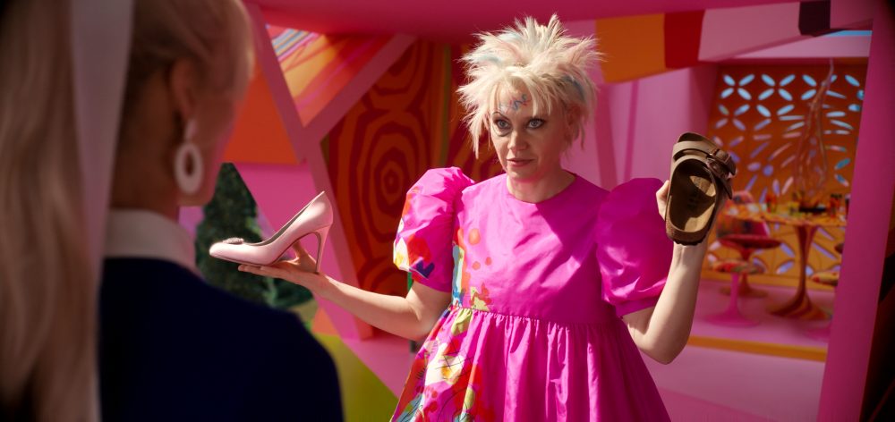
Weird Barbie’s (Kate McKinnon) house is a favorite of the production designer. It was also one of the last set builds Greenwood and Spencer worked on and “that was one of the last things we shot,” says Greenwood. Although Weird Barbie’s house is kooky mid-century modern in contrast to the “Psycho” house’s Victorian style, the Alfred Hitchcock classic provided inspiration from the skewed stairs leading up to the door.
Sarah Greenwood/Warner Bros.
“One of my early references is that you go up the stairs, and there’s the ‘Psycho’ house, and we brought in other elements.” Its design was deliberately skewed with everything pushed out of shape and out of order,” she says.
And like the rest of the Barbie houses, Weird Barbie did have a pool, but it wasn’t shown. “It has a swimming pool in front, and we painted a shark at the bottom of it,” Greenwood reveals.

Sarah Greenwood/Warner Bros.
Adds Spencer, “We added Weird Barbie’s cat. Like everything else, it’s camouflaged. But her cat is 4 ft. 6” and it’s a cutout looking at the shark.”
Another tidbit Greenwood shares about Weird Barbie is the inspiration for the ambulance. She says, “When you look at Weird Barbie’s ambulance, she has hijacked it and made it hers. It looks a bit like her house. That is taken from ‘Wacky Races’ and it’s inspired by The Creepy Coupe.”

Sarah Greenwood/Warner Bros.
With Barbieland, the cul-de-sac was built so the cast and crew could walk along “The Wizard of Oz” inspired pink brick road. That was one of the many puns and nods to films they could put into their designs.
A humorous nod Spencer enjoyed was renaming all of the books in the film. little puns as well. “We had ‘Barbie Karenina,’ ‘Barbie in the Willows’ and ‘Moby Barbie. With Ken’s books, we had ‘Men Who Love Mink’ and ‘Why Men Rule the World,’ laughs Spencer.
The biggest challenge for Greenwood and Spencer was that in building the houses that had few walls, every little detail needed to be taken into consideration. “Everything you saw, you saw into another house. You had to be aware of the action that was taking place there and beyond. So, we had to consider the color and every small thing because nothing was hidden,” explains Spencer. “The cars didn’t have engines, and not all the houses had stairs, so we were taking away so much stuff that you normally hide behind.”
The designers reveal Gerwig was able to tap into her love for musicals during the dance number “I’m Just Ken.” Greenwood suggested during that long dream sequence they play into “Grease” and how during “Greased Lightning” the T-Birds led by John Travolta transform out of a garage and into a white space. “I said, ‘Why don’t we do that?’ So, we built an empty stage and painted it pink and blue.”
In all, the art department had 12 main shades of pink, and over 100 different additional shades. There was no black and white or chrome in Barbieland.
It’s not until Ken takes over after visiting the real world that they do finally insert those colors and stuck things on in the most inappropriate way. “Kendom has lots of white, black and chrome and turns it ugly,” says Spencer. She spoke with Gerwig about how far they could go with this “ugly” that Ken brings, but the director wanted her to push it up to juxtapose with all the pink. Says Spencer, “We were very pleased when we went back to Barbieland in a harmonious way.”


