Mickey’s Toontown opened at Disneyland in 1993, inspired by the wild world of “Who Framed Roger Rabbit.” But now, after a yearlong closure and refresh, Toontown is doubling down on Mickey Mouse and friends while adding patches of picnic-ready green space that get children out of the strollers and running free.
The hope is that Toontown 2.0 becomes a place that prioritizes imaginative and interactive play, specifically for younger children. While the area’s rides are designed to accommodate as wide an audience as possible, play spaces are typically defined as targeting those in the 2- to 12-years-old range.
The new Toontown is part of a broader movement to refocus theme park experiences around games and play, which help foster communication among friends, families and even fellow park attendees. One could draw a line from Toontown’s lighthearted playground fare to the digitally-focused games at the nearby Star Wars: Galaxy’s Edge and the large-scale interactivity of lands such as Super Nintendo World at Universal Studios Hollywood.
Every aspect of the re-imagined Toontown, which officially opened today, was designed with play in mind, even paint color.
When Disneyland’s Toontown opened 30 years ago, it was full of harsh slants and brash colors — a wildly painted world based on clashes of styles and tones rather narrative cohesion. Take a stroll through its refresh and one major change is immediately apparent: The colors are muted, and at long last feel in harmony with one another.
Mickey and Minnie figures installed on New CenTOONial Park Fountain at Disneyland’s Toontown.
(Irfan Khan / Los Angeles Times)
Gone are colors that look CGI-created, and in their place throughout is a more painterly feel. In turn, Toontown no longer feels disconnected from the rest of the park. It still has buildings and houses full of curves and purposefully disjointed slants, but overall Toontown has been ever-so-slightly grounded in Disneyland’s comforting, welcoming version of reality. Such a style makeover wasn’t done simply to bring the land more in line with modern tastes, says Walt Disney Imagineering, the arm of the company that oversees its theme park experiences.
Child development concepts are at play.
Designers, say Elliott Rosenbaum, Toontown’s creative producer, “wanted to make sure the color palette of the land was softer, a little gentler. There’s a movement in play, especially in young children and young-child development, to make sure that you’re providing as much decompression as stimulation. We know Disneyland can be a very stimulating experience. We wanted Toontown to be relaxing, a decompressing experience. It’s largely inspired by nature — softer tones feel easier on the eye because they very much come from nature palettes.”
It’s a shift.
Increasingly, our worlds — and especially our theme parks — seem geared toward play. “Play is necessary for development,” says Ryan Wineinger, Toontown’s senior creative director. “It is biologically necessary. It is the first moment you learn about who you are, what risks you want to take, what you feel comfortable engaging with, what preferences you have. For children, they’re experimenting with who they ultimately grow up to be. Play is the foundation of that.
“Let them find themselves here. And you’ll notice things are a little large in the land, too, so adults who maybe haven’t played in a while can engage with that childlike spirit.”
Holding onto that childhood spirit is vital, and even as a grown-up visiting Toontown with friends and their children, I felt the pull to jump in a large water lily-like spinning chair outside of Donald’s boat. Goofy’s House, once a place to bounce around in, is now a sort of candy-making factory. It’s a more inclusive design that allows adults and kids of all mobility to participate together, turning standard kitchen items into rhythm-making machines. Games, by requiring us to learn and participate, prompt us to be present in the moment and to focus on those who we’re with.
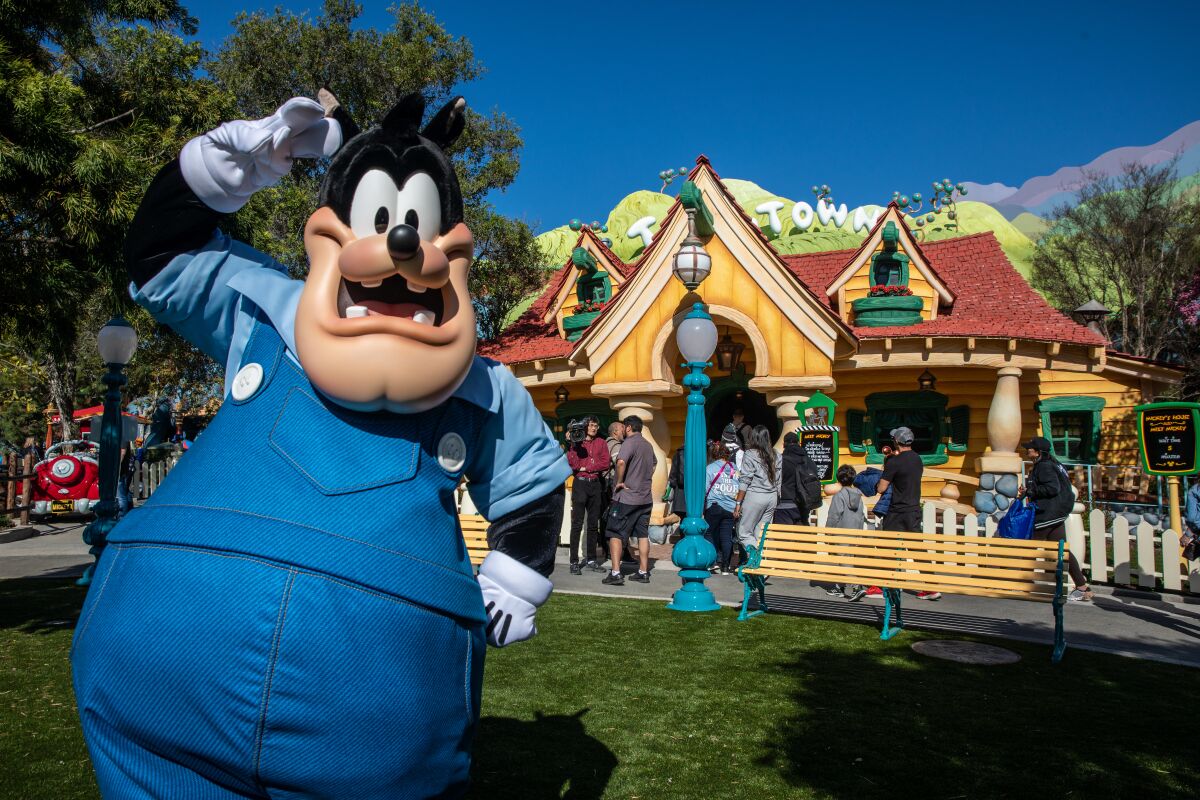
Disney character Pete makes his debut at Toontown, which has a refreshed look.
(Irfan Khan / Los Angeles Times)
Games are also conversational tools. Play helps safely bring down our natural barriers by creating guardrails that allow us to be silly. Specifically, games allow us to be vulnerable, showing sides of ourselves not often glimpsed.
“Play is foundational to growth and independence, and that’s very important to us as a team,” Wineinger says. “It’s also really important for families and friends to be able to play together. This is an opportunity for mom and dads to play with sons and daughters and cousins and to play together and strengthen communal bonds through a shared experience.”
The re-imagined Toontown is anchored by the new ride, Mickey & Minnie’s Runaway Railway, a celebration of modern animation that opened in January. But one large goal for the land as a whole was to re-prioritize green space. At the entrance to Toontown, adjacent to a new vibrant Mickey and Minnie-focused fountain, is CenTOONial Park and a large tree whose oversized roots could be used as tiny slides, or leaning posts for the more contemplative set. They also provide space to crawl under and around.
Multiple green spaces include a large plot of land in front of the very fine dark ride Roger Rabbit’s Car Toon Spin, which has survived the transition. That plot had been home to a fountain themed to the 1988 film. Wineinger says research indicated that families needed more wide-open areas in a play-focused land.
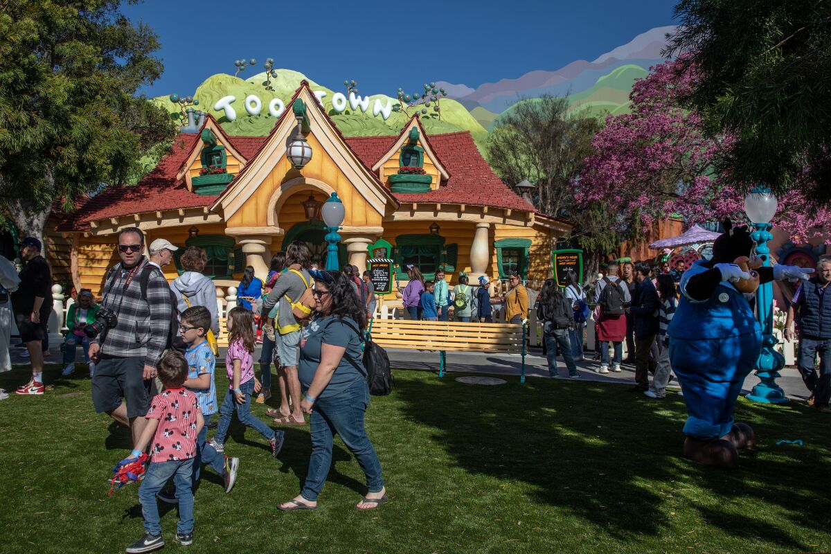
Toontown’s refresh includes plenty of shady green space.
(Irfan Khan / Los Angeles Times)
“In our bench-marking that we did many years ago with our own young families, we laughed because no matter how cool the place we took them to was, if there was a yard and trees, they found it and they loved it as much as the really cool slides,” Wineinger says. “We learned from them that it’s necessary to give them a chance to let off some steam with no demands and just be with nature. So as a philosophy to make this land something that is young, family forward and friendly, it became important that half of this was green and under natural shade.”
And filled with water. Donald Duck’s boat is a holdover from the previous incarnation of the land, as is the kid-focused coaster Chip ‘n’ Dale’s GadgetCoaster, but the boat now is surrounded on one side by a small splash pad. And the centerpiece Mickey and Minnie fountain is designed to be touched: At its base are mini fountains — Imagineering calls them “water tables” — in which water shoots upward and outward, inviting guests to get their hands wet.
“Water is challenging,” Rosenbaum says, adding that his team wanted to encourage children to play without getting overstimulated or agitated. “Water was the first stop at every single destination we visited, and we realized it’s because it’s just as relaxing as it is to touch as it is engaging to touch. So it’s like the perfect play.”
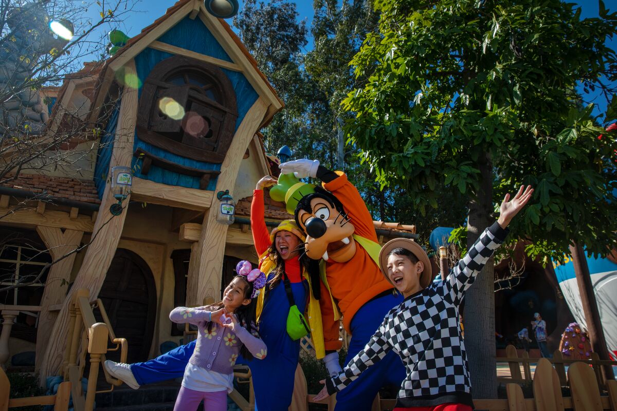
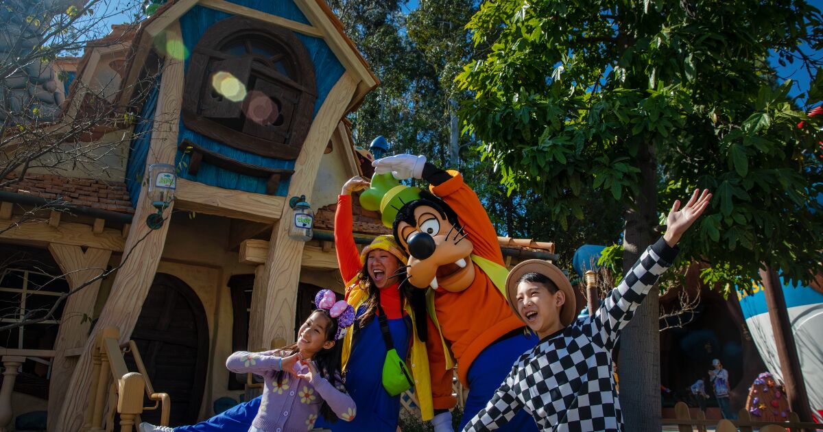
Rosie Soo and her children Callie Soo, 9, and Austin Soo, 11, get their photo taken with Disney character Goofy at Toontown.
(Irfan Khan / Los Angeles Times)
Also vital was a design that could be appealing and accommodating to all children. To that end, all curbs have been removed from Toontown, to make it easier to navigate in a stroller or a wheelchair, and slides have “dignity landings,” allowing extra time to stand up without becoming a center of attention. Sounds, too, have been toned down, so Toontown remains full of appealing and distracting noises. (A beehive will hum near Goofy’s house.) The hope is that one sound will give way to another rather than compete for attention.
And for adults who don’t want to join their children on a slide, the re-imagined land is outfitted with bench seating around the free-play areas.
“Practically, when we think about the experience of a young family at Disneyland, you have a lot of time where the kids are getting pushed around in a stroller,” Rosenbaum says. “We wanted an opportunity where kids could get out of the stroller and run around, crawl around and flop around, and we provided turf areas where kids could do that. And parents can take a little bit of a load off — take a seat under the shade and watch the kids run around. I think it tonally changes the experience you could have at a theme park.”


