How can you make your production design killer?
This post was written by Sara K White.
As a designer, on every project, I look to facilitate stories about unique characters while growing my skill set. When I was approached by the showrunners, Janine Nabers and Donald Glover, about SWARM, I knew I would be exploring a world that was unseen in the media – that of a young, black, female serial killer.
Based on an amalgam of true stories about stan culture gone awry, we follow Andrea “Dre” Greene (Dominique Fishback), an emotionally stunted young woman whose neurodivergence has been exacerbated by years of trauma. Unable to form acceptable connections with people, she bonds deeply with individuals who she believes can speak for her and requires that devotion in return – whether or not they know she exists.
With TikTok and the Influencer Economy rising at a fever pitch, it felt especially timely to do a project about parasocial relationships gone awry. Being offered the task of developing the world of a ferocious, disturbing, and sympathetic woman was immediately exciting.
How We Designed Swarm
As we were developing the project, we spoke about films featuring people going over the edge – a favorite touchstone was The Piano Teacher. For the design of the spaces, I thought a lot about the films Gummo, Mandy, Monster, Madeline’s Madeline, and a personal favorite, Jeanne Dielman, 23 quai du Commerce, 1080 Bruxelles. I loved the play between design and cinematography in creating the interior worlds of the characters.
I also referenced the work of photographers Nailah Howze, Rania Matar, and Deena Lawson, who all capture women with great raw energy.
Each episode takes place in a new city, with Dre in a completely new environment. Determining a point of view for the visual landscape was critical to making the episodes feel cohesive. In the design, I worked to convey Dre’s disconnect from reality.
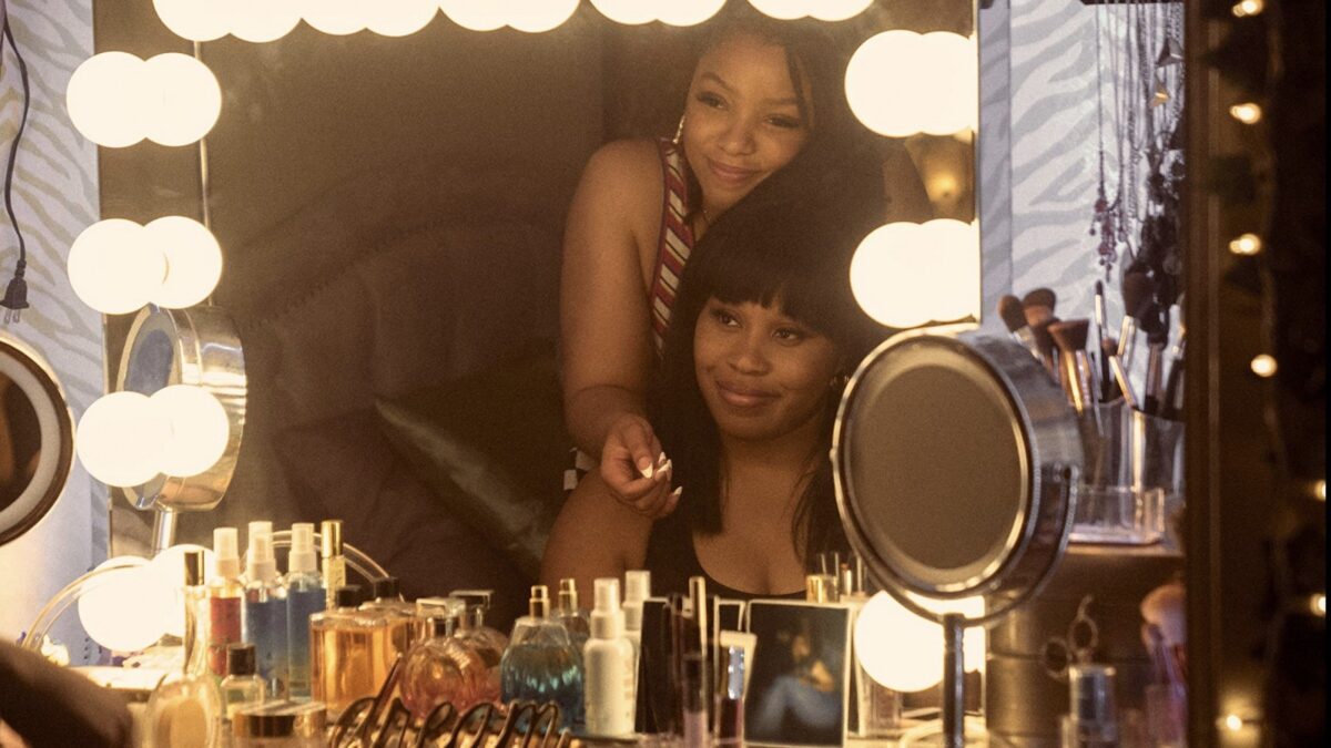
To that end, I worked with my team to create spaces that walk the line between worlds. In Dre’s apartment, I played with maturity and immaturity. In Khalid’s (Damson Idris), we made sure the space’s décor was just slightly asymmetrical. In episode four, we created a sleeping quarter in a beautiful home that is directly inspired by 1940s mental hospitals.
In other episodes, I worked with our DP, Drew Daniels, to build a color space that went toward clashing colors. For example, episode two sees Dre in a hotel room with walls painted what I can only call “Puke Green.” Nothing was aesthetically out of bounds, and I loved having such a rich palette to play with.
Given the wide scope of the show, our locations ran the gamut from disgusting hovels to McMansions, from strip clubs to wellness centers. Even with a fast schedule, my dedicated team was as inventive as the rest of the creative team.
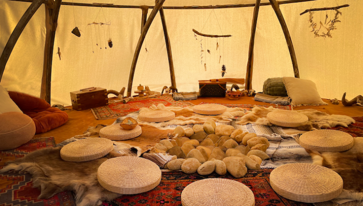
For the art department, we really rose to the occasion creating the sweat lodge for episode four. It was originally scripted to take place in an outdoor environment, but we couldn’t find the right location, so we needed something new.
Together with Steven Glover and Ibra Ake, we came up with a space for Dre to experience trust and communion with the cult members: a glamped-out sweat lodge.
In only a few days, we built a structurally sound sweat lodge that offered beautiful light and intimacy, while subtly surrounding the characters with hides, skulls, and bones of long-dead creatures. Collaborating to freshly reimagine scenes is so rewarding, and I am so proud of how we pulled it off.

Designing my first thriller/horror/comedy was helped by years of experience on projects that had 10 percent similarity here, and 10 percent there. I pulled ideas about architecture, color, and tension from shows as disparate as Pariah, Stand Clear of the Closing Doors, and The Flight Attendant.
As a person deeply interested in what creates and maintains society, I pulled from years of thinking about how humans relate to each other. It fascinates me how that can go wrong, and how miraculous it is that it goes right so often. I also pulled from my own life experience. Especially as a child, entering a new space often had a profound impact on me.
I think we’ve all walked into a room and felt a shiver down our spine or some kind of raw discomfort. I’m glad for the time to think about and evoke that for the characters and the audience on Swarm.
Let me know what you think in the comments.


