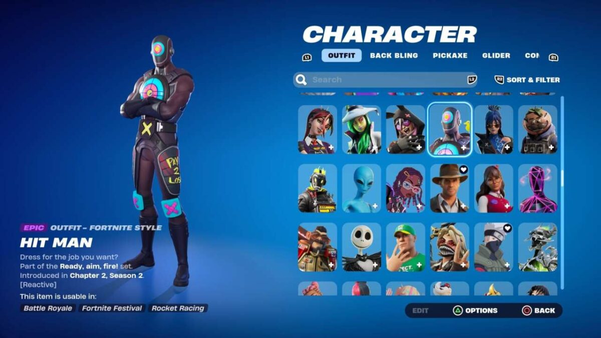
Fortnite Chapter 5 has been pretty great so far in the ways that matter most–the battle royale gameplay feels different in a good way, and the battle pass is one of Fortnite’s best ever. But it’s also managed to introduce a totally revamped locker UI that adds support for new cosmetics related to the new Lego, Rocket League and Festival modes–and which makes the customization experience a lot worse than it used to be, inspiring a ton of backlash from fans–this has been an even bigger topic on reddit than the changes to movement have been.
When I say the locker experience has gotten worse, I don’t mean that in a “this looks new and different and I don’t like that” sort of way. Nearly every aspect of dealing with your locker while using a controller–such as equipping skins and other cosmetics–now takes significantly longer, and there are key functions from the old locker that somehow got left out of this revamp all together. Since most Fortnite players use controllers, it’s a bit of an issue, as all these constant wasted seconds add up.
The “why” of all this is beyond my paygrade, so let’s cut to the chase and take a look at a list of ways in which Fortnite’s locker experience now functions worse with the new UI.
1. Selecting the button to enter an item’s detail menu in your locker equips the item, and every time you examine any style in the detail menu it equips that style automatically as well.
2. Archiving used to involve switching to a mass-select menu. Now, there’s no mass-select option, and archiving an item requires navigating a dropdown menu for each individual item.
3. Favoriting an item in your locker used to require one button press, and now you navigate a dropdown menu for each individual thing you want to fave.
4. You can no longer return to the top of your locker menu by pressing Triangle/Y. This means that in order to unequip an item or randomize a category, you have to manually scroll to the top, which can take a while if you have a lot of stuff.
5. All locker presets have been broken, keeping the assigned skin, back bling, pickaxe, glider and contrail, but separating out emotes, wraps, banner, loading screen and lobby music. Now it’s not possible to assign specific emotes or wraps to a skin preset at all–the new UI includes a separate group of emote presets, as well as wrap presets, but these different types of presets can’t interact. You have to manually choose your skin preset and your emote preset and your wrap preset separately.
6. On top of that, there’s no longer an option to shuffle your locker presets. Previously, you could put your presets on random and they would switch each match. Now, you can only choose presets manually.
7. You used to be able to clear all your locker notifications, which come up every time you unlock something new, all at once with a single press of a button. Now, the locker has been broken up into seven distinct segments, and you have to clear each segment’s notifications individually, and each one now requires navigating a dropdown menu instead of having a dedicated button that does this.
8. It’s likewise with the new “randomize loadout” feature. You can randomize sections individually, but you cannot randomize your entire locker at once. If you don’t like what the randomizer gave you, it requires six button presses every time you want to try again.
9. Sorting a locker section by your most recent items previously required two button presses, and now it requires eight. This change actually happened during OG season, but it was exacerbated by a new quirk in Chapter 5: If you close the “sort & filter” menu by hitting the cancel button, no matter what, it will always return to the default sorting. So if you’ve already sorted by recent, and then open and close the “sort & filter” menu without changing anything, it will put you back on the default sorting.
10. Rarity colors have been removed from the locker, even though everything is still sorted by rarity by default. That makes navigating the locker an all around more difficult experience—the color coding was very helpful for helping keep track of where you were in your locker while you quickly scroll up and down, and so now, for those of us with stacked lockers, it takes longer to find things. Sorting alphabetically helps, but the color coding was a great visual shorthand that was easy to process.
11. Scrolling right or left to the edge of your locker used to either take you up to the previous row of items or down to the next row, but now scrolling to the edge does nothing at all.
This list isn’t exhaustive, and mouse-and-keyboard schemes have a whole other host of issues unique to that interface. What’s interesting about all this is the UI isn’t particularly buggy–for the most part it’s built to be this way. That doesn’t mean they wanted to turn out like this, with key missing features–it’s more likely just an unfinished rush job full of oversights, possibly affected by all those layoffs Epic did in September. Hopefully it’ll be updated sooner rather than later, but with the holidays in full swing I wouldn’t get my hopes up for any major fixes until January.
The products discussed here were independently chosen by our editors.
GameSpot may get a share of the revenue if you buy anything featured on our site.


